Project Info
As Alkami reached the point of scaling the white-label digital banking SaaS platform, it became clear an automated & dynamic color system was needed to both ensure accessibility for color contrast, but also to eliminate bespoke design & dev projects for each new client.

Explorations
With hundreds of clients utilizing an unpredictable combination of color palettes, it was no longer possible to fine-tune and optimize the platform for each customer implementation. An automated and programmatic solution was needed. After iterating through several ideas, finally a solution was reached and the system ensured both the color contrast accessibility needs were met as well as the integrity of each brand color palette.
1st iteratation: adding white or black
Initially creating ramps based on just changing the black or white levels seemed like a great approach; however, this produced muddy and lifeless colors at the high and low ends. This was especially true if the customer branding used orange or red tones.
2nd iteratation: RGB manipulation
Using the RGB color model enabled the full spectrum of color to used in each ramp. In theory this provided the best possible scenario to future proof the ramps in the event a client used a unique set of branded colors. In practice though the color combinations and math required to ensure a consistent luminosity at each step regardless of the base color ended up being a large engineering lift.
3rd iteratation: HSL manipulation
Although the HSL color model is a bit limiting compared to RGB, the math is much much easier to crunch. Even after testing with dozens of branded colors, the ramps ended up virtually indestinguishable compared to the matching RGB ramps. Ultimately the sipmlicity of the HSL model ended up being the deciding factor.
Dynamic Contrast
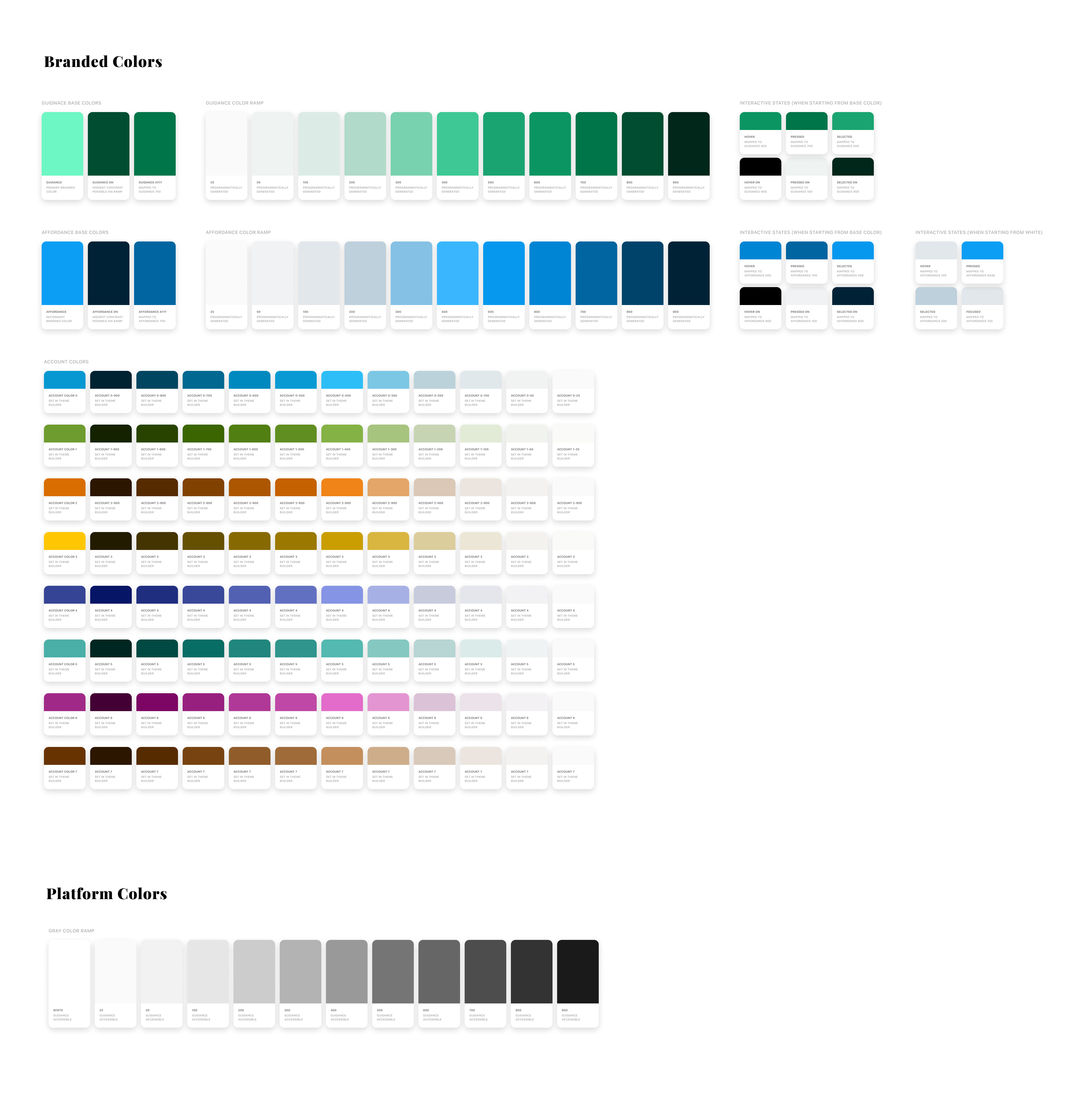
Built into the color system is a set of colors referred to as "On Colors". These colors represent color when used on top of another color of the same family. For example when treating button labels that rest on top of the background color of the button, utilizing the On Color ensures color contrast is met.
How it works
The system takes the base color and generates a ramp of lighter and darker colors. Then tests each color against the base color until it finds a step that has at least a 4.5:1 color contrast ratio. If a step cannot be found to pass contrast requirements, the system will test if either pure white or black works. If none of the steps or white/black work, then the base color is lightened slighly until black passes as the On Color.

User customization
Using the UI sliders, a user can manually manipulate each color step in the ramp — adjusting the saturation or lightness. Using the calculated luminosity, each step is restricted to stay withing a high and low luminosity range. No matter what the user does, nothing can take the step outside the predefined range and break the system.

Using the system
Once the ramps are created, and the user has a chance to manually adjust saturation or lightness of each step, a JSON export is created. This JSON object contains the key value pairs (design tokens) for each color ramp. An engineer can then reference the JSON object and dynamically pull values for their project. If the JSON object is kept in a central location anyone can pull from it or update it at any time and everyones projects keep the same color treatments.