Project Intro
The Alkami Design System is a sophisticated set of user interface components, patterns, and frameworks that both internal designers and engineers use daily — in addition to external SDK teams building custom experiences on The Alkami Platform. A truly remarkable body of work representing an investment that will pay for iteself over and over for years to come.

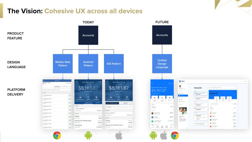
Following a unified design language across all channels (web, iOS & Android), the components were developed for use by both Vue & Flutter engineers. Visually components look and 'feel' the same from web to native, with just subtle differences based on whether the user interacts with the UI via touch or mouse.
From start to finish (finish = engineers using components in real production environments), the entire process of imagining, planning, getting buy-in, designing, developing, documenting, and communicating represents just over 3 years of work by dozens of designers, engineers, product managers, quality assurance engineers, scrum masters, and architects!
My role
As the lead designer, my role as a player coach was to manage the efforts of the design team, the relationships between design, engineering, and product, and to be the communicator with stakeholders and leadership.
Problems to solve
As with any big R&D project, there were big problems to solve. By no means exhaustive, the following are a few of the key problems a new design system would fix & push us farther ahead in relation to newer competitors in the market:
- Lack of mobile/touch friendly components and interaction patterns
- A dependency on bespoke theming work for each new client blocked our ability to scale
- Wildly inconsistent styles and patterns throughout mobile & desktop due to each scrum team independently using their own set of copy/paste raw HTML code snippets
- Lack of mobile SDK for 3rd parties meant more custom work in-house
- Visual aestethic was old & worn out resulted in tougher sales cycles
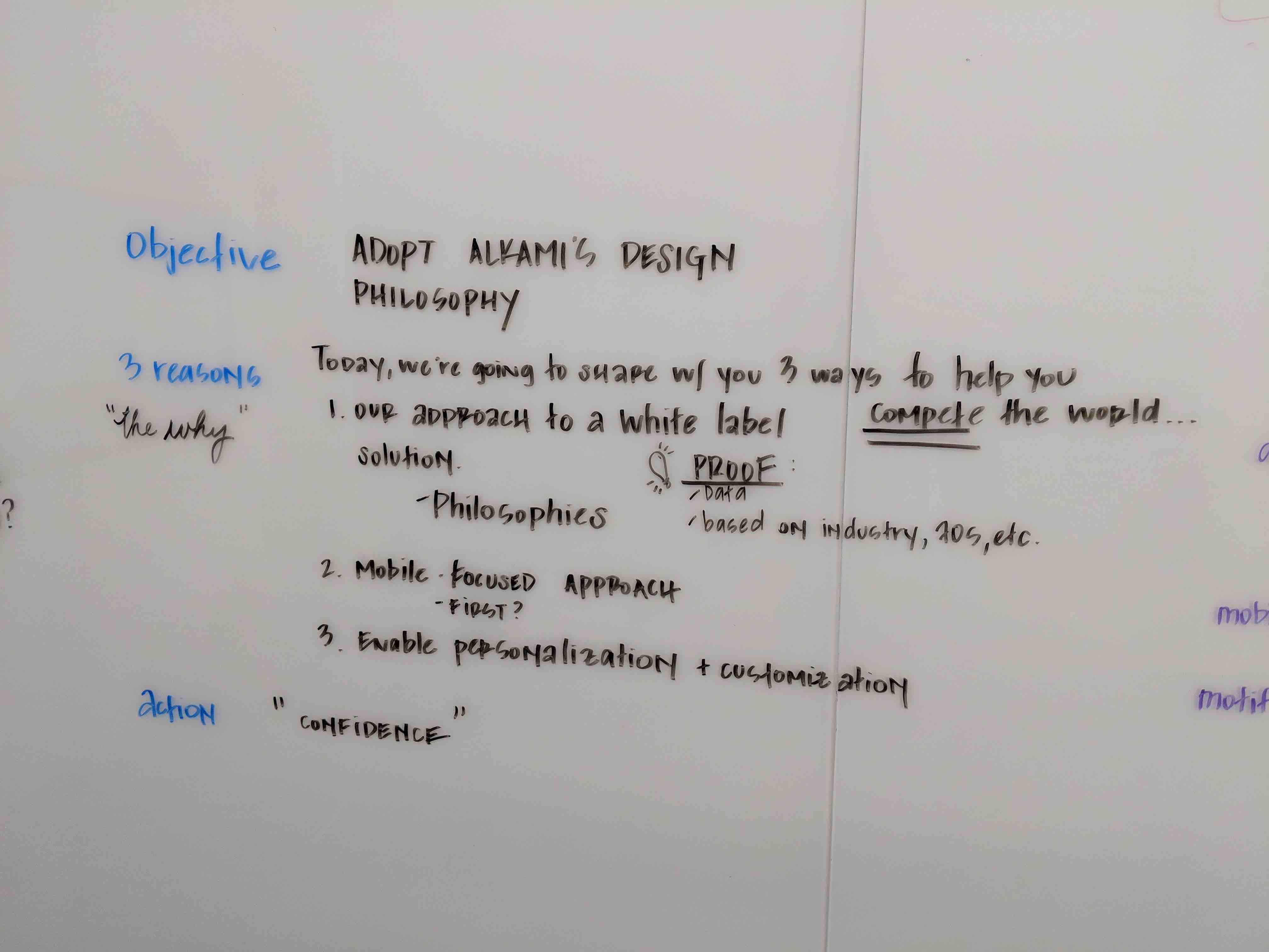
With newer competitors popping up in the market, we were feeling the pressure from sales to come up with something sexy, and fast! Perhaps the biggest problem was the lack of a dedicated project from the product team, so we essentially had to do this around all the other work while supporting 14 scrum teams — each with their own timelines and commitments that couldn't slip. Talk about being in between a rock and a hard place! Sales applying pressure on one end and product on the other.
We could see the insane value and tenaciously carved out time to make the project a reality.
Explorations & Research
Starting off with research to understand what the market would bear (the visual zeitgeist), and what would resonate most with both clients and end-users, we started with a few vision/mood boards.
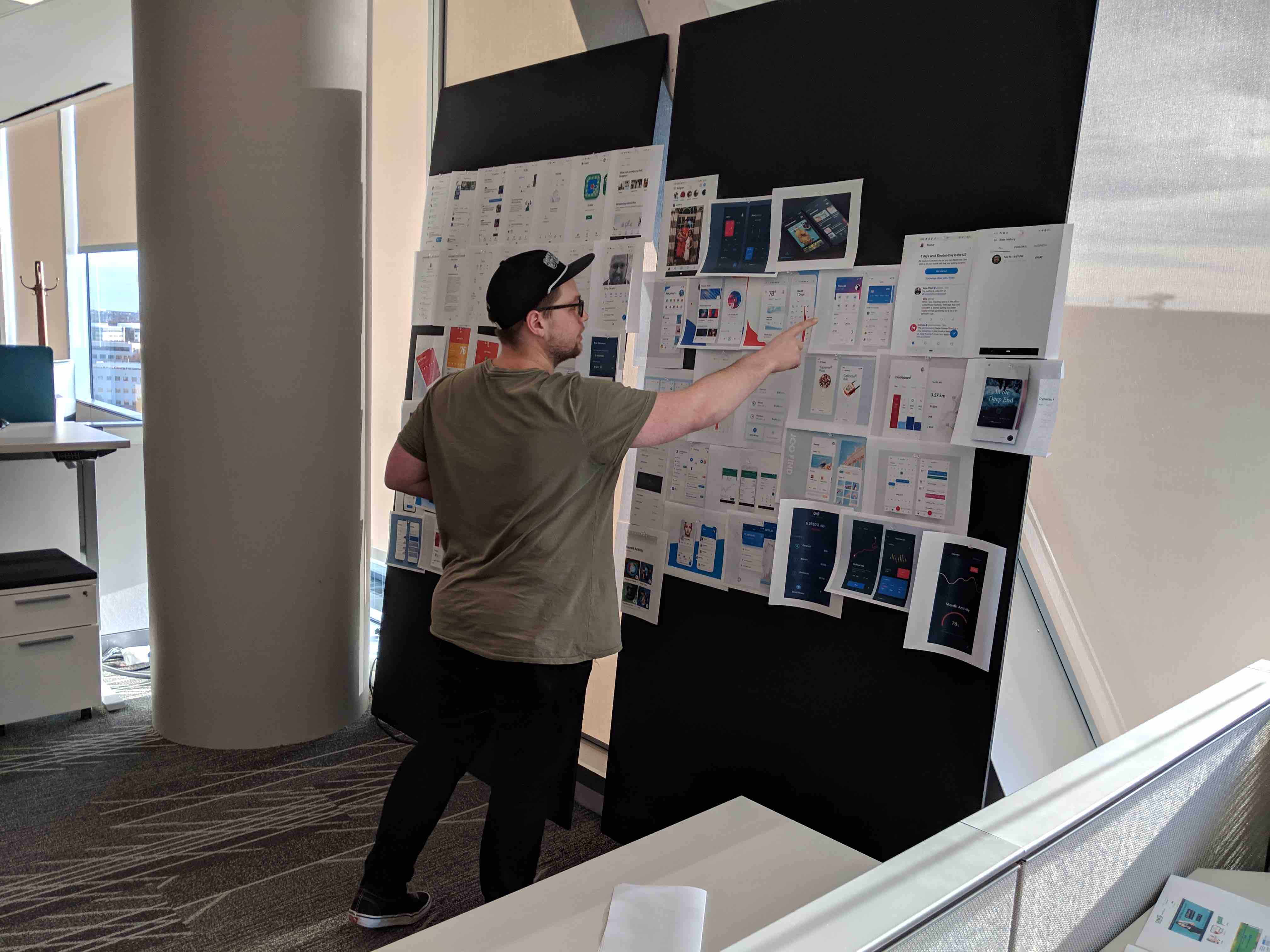
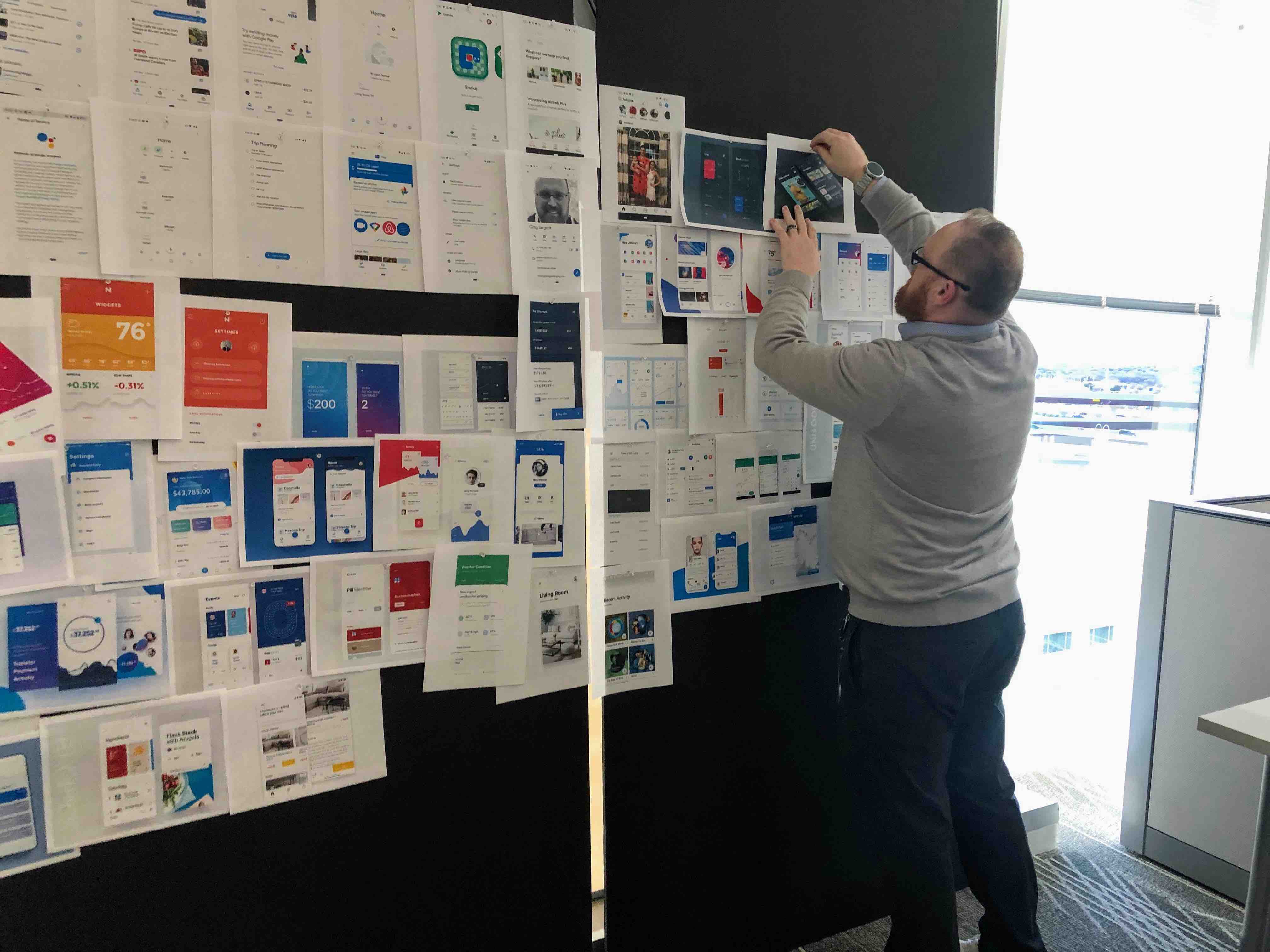
UI Audit
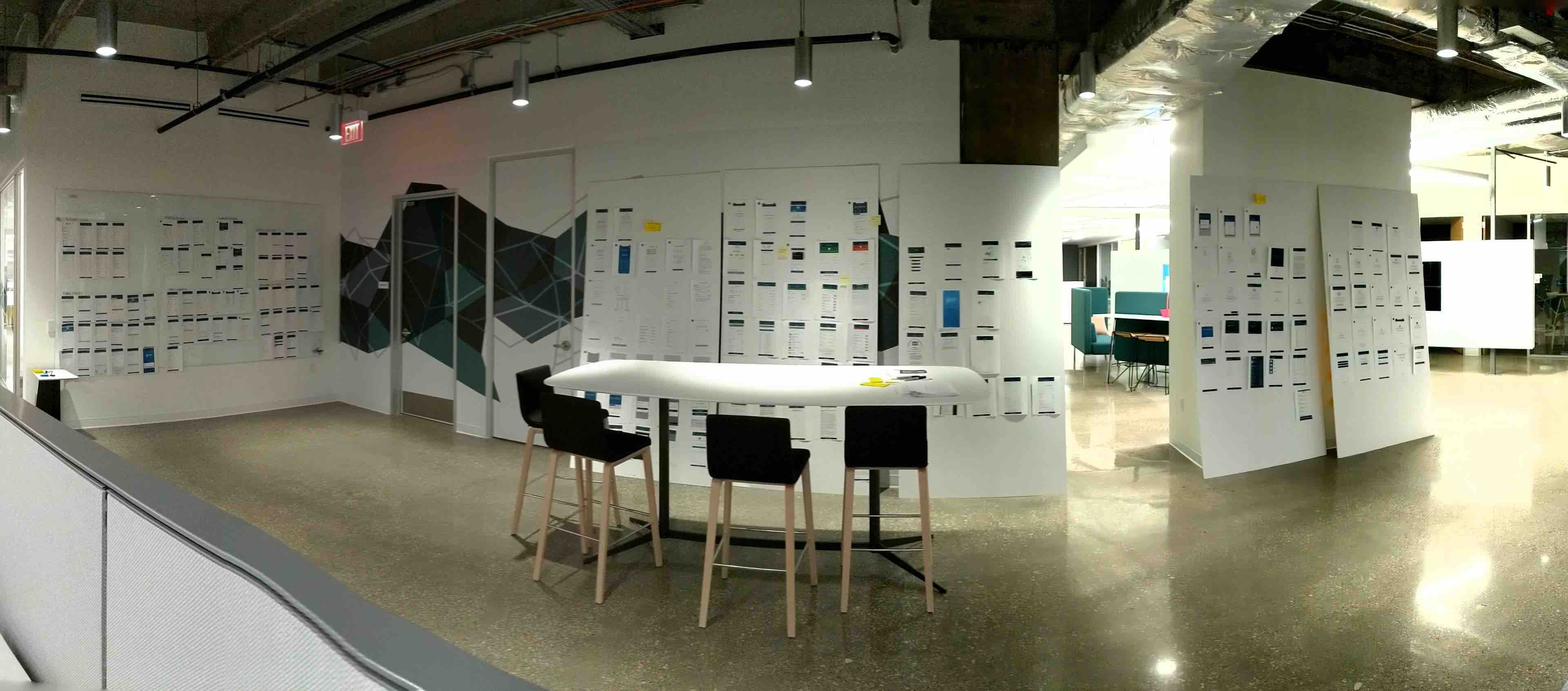
It was important to understand all the existing patterns and various treatments across the legacy mobile experience to not only ensure we had a replacement for all similar component types, but also to quickly scan and pick up on different ways designers had solved similar problems over the years. This would later become very helpful in coming up with use-cases and examples for "do's & don's" in the new component documentation.
Team building
It was also increadibly important that every member of the team (designers & engineers) contribute and be included. We had seen with our previous design system efforts that a small group worked independently but struggled to get buy-in and adoption later. I also learned about adoption issues from An Event Apart Orlando conference where several sessions focused on adoption and getting the entire team on board from the start. So I arranged an epic full day off-site event to collaborate and get everyone involved. We made sure to include engineers from the web, iOS & Android teams.
I rented some coworking space outside the office, catered lunch, had a bunch of snacks and killer swag bags, and some cool raffles to keep folks engaged and pumped. We explored, debated, laughed, and had a great time. Most importantly we came out the other side with a mutually agreed set of design philosohpies and principles that would guide us through the next phase.

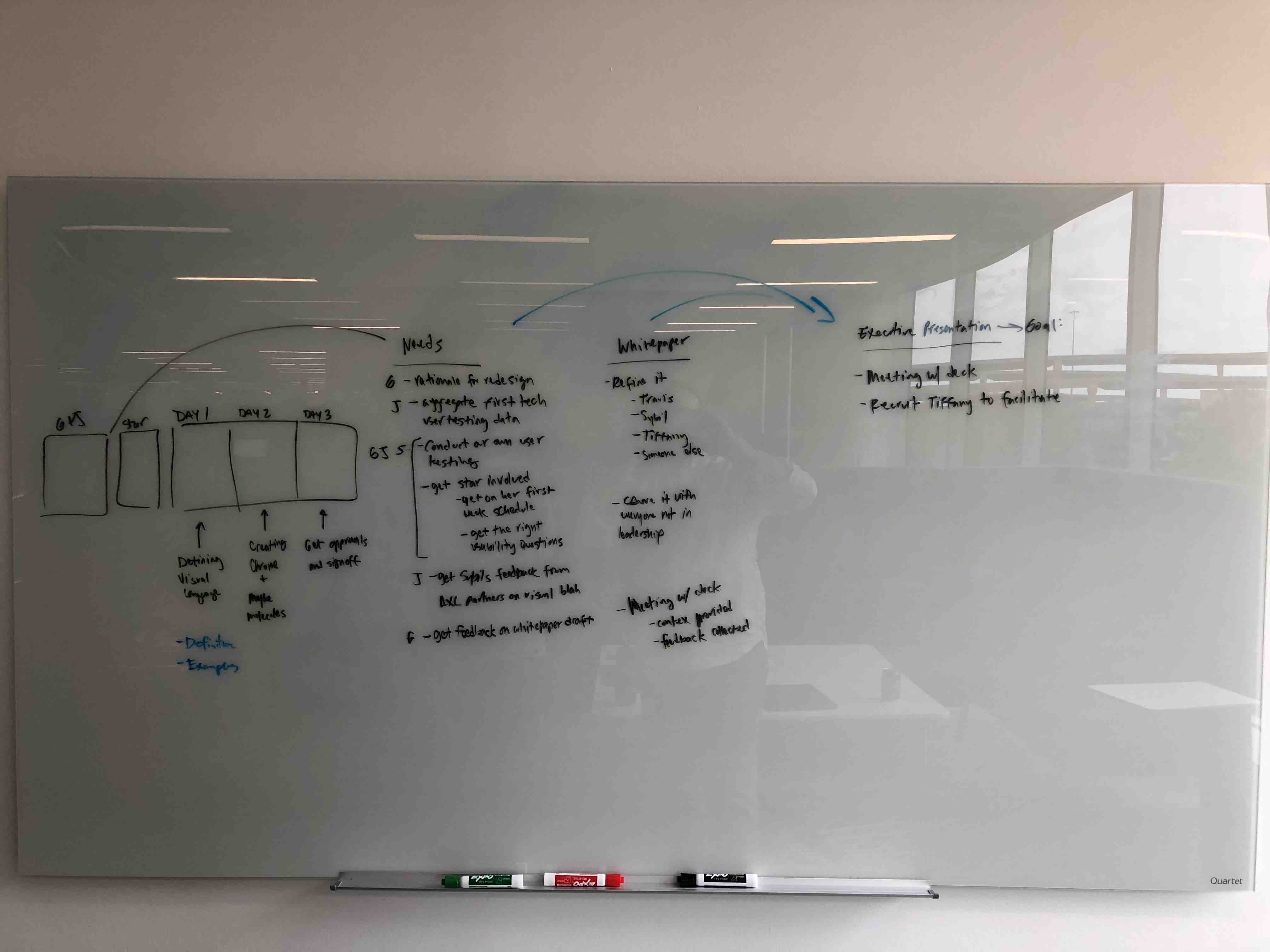
Building hype
As things really started to take off, we wanted to keep the mementum up and continue to build the hype. One way we realized this goal is through publishing a splash page on the design system documentation website months before any component documentation would be completed or published.

Exploration
Each member of the team had their own unique strengths to contribute, so we made sure to break up the work to take best advantage of both time and skill set. We were given just one sprint off from the usual workstreams to nail down the visual language.
Solution
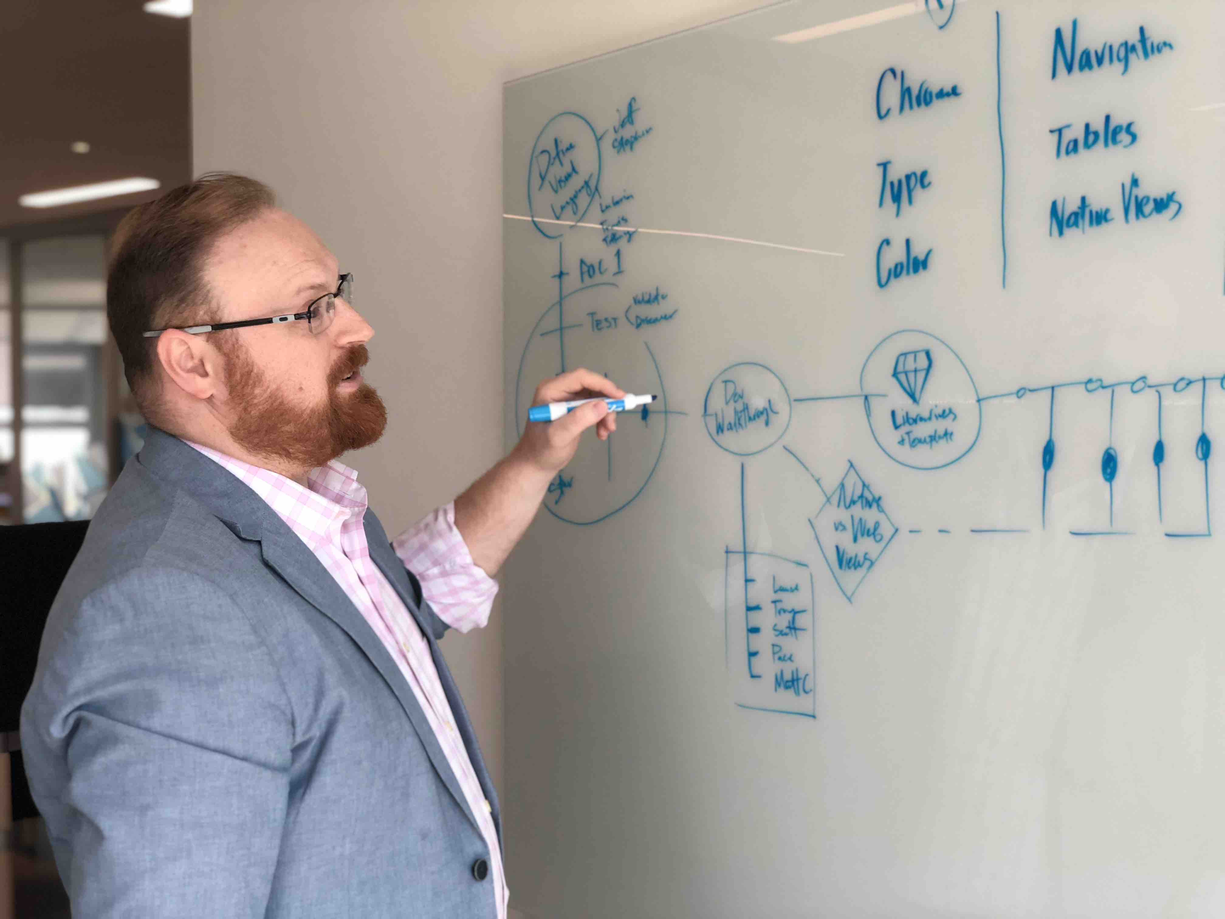
At first progress was slow due to tough and often conflicting philosophical viewpoints on hierarchy, spacing, or emphasis. As we iterated through component after component we started to identify a consistent set of decisions made over and over again — sometimes contradicting previous decisions requiring a review of a component we had considered done. Soon a set of repeatable design decisions, once identified, sped the process up significantly as we no longer needed to debate merits of this or that subjective opinion.
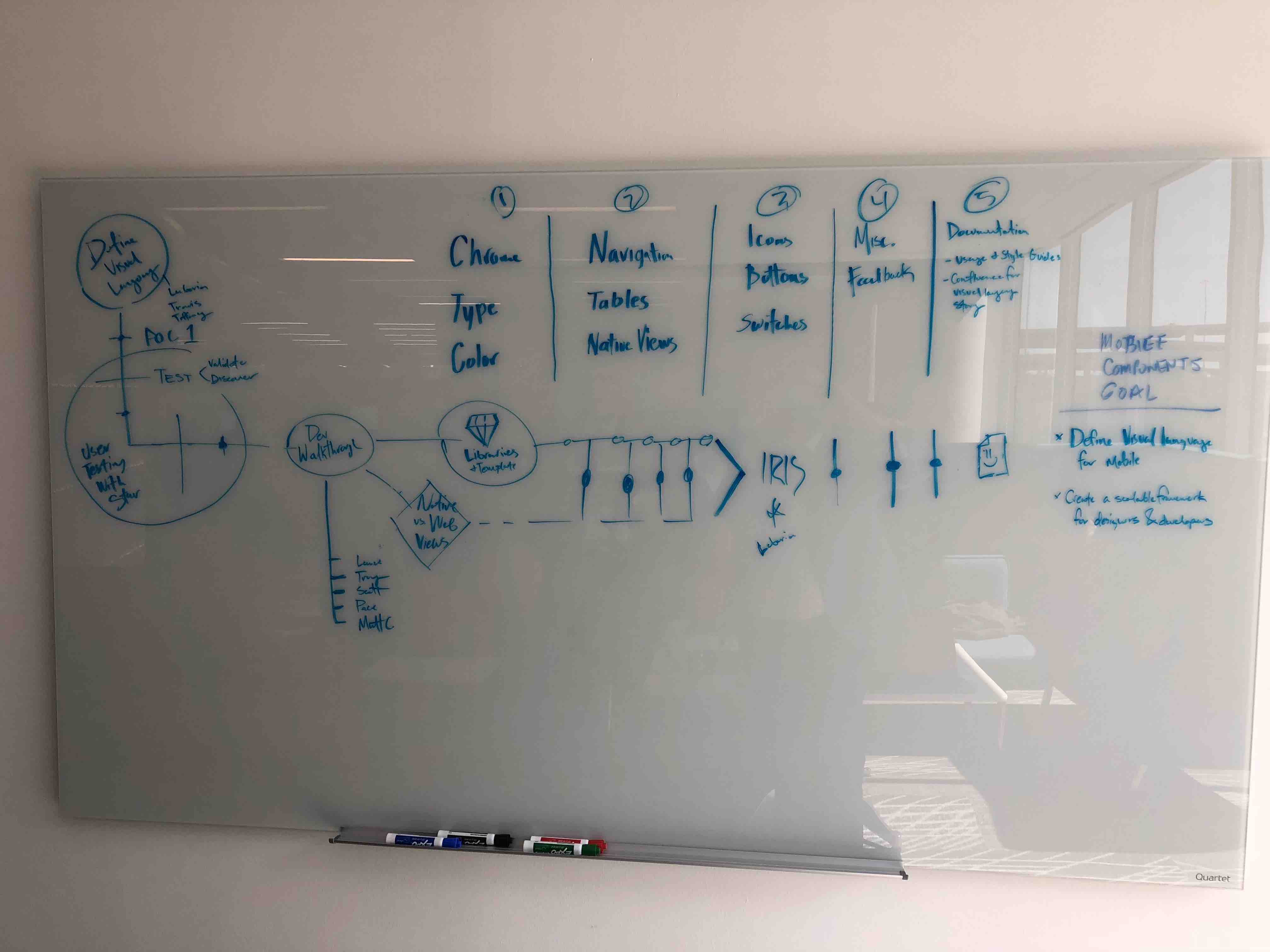
7 design frameworks
These repeatable design decisions became known as our design frameworks, each deserving of an entire article! In fact we dedicated a page to each framework on the documentation website. Here's a summary:
- Color: Intentional and meaningful use of color (Affordance, Guidance, Messaging, Platform, etc.)
- Type: Typographical styles set at specific sizes and weights to ensure clear hierarchy and reinforce branding
- Icons: Line art styles set at specific sizes to align just right with type and other atoms
- Spacing/Sizing: Based on 8 and scaling using the golden ratio
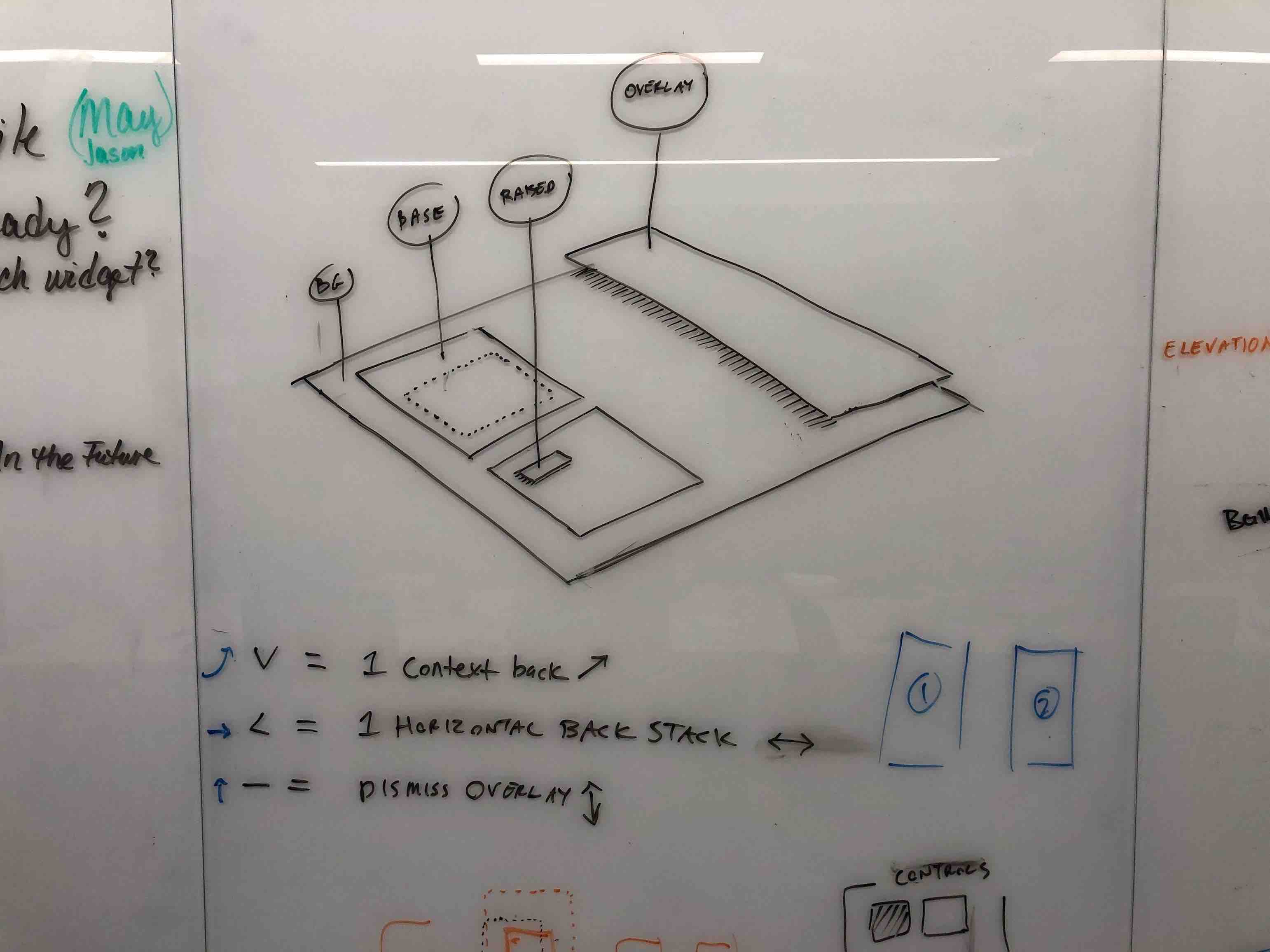
- Elevation: Pattered after Material Designs concept of surfaces but with more guidelines
- Emphasis: System used to draw the eye or provide separation
- Motion: Key to understanding what happens as various UI elements change shape/size/visibility
CMS documentation site
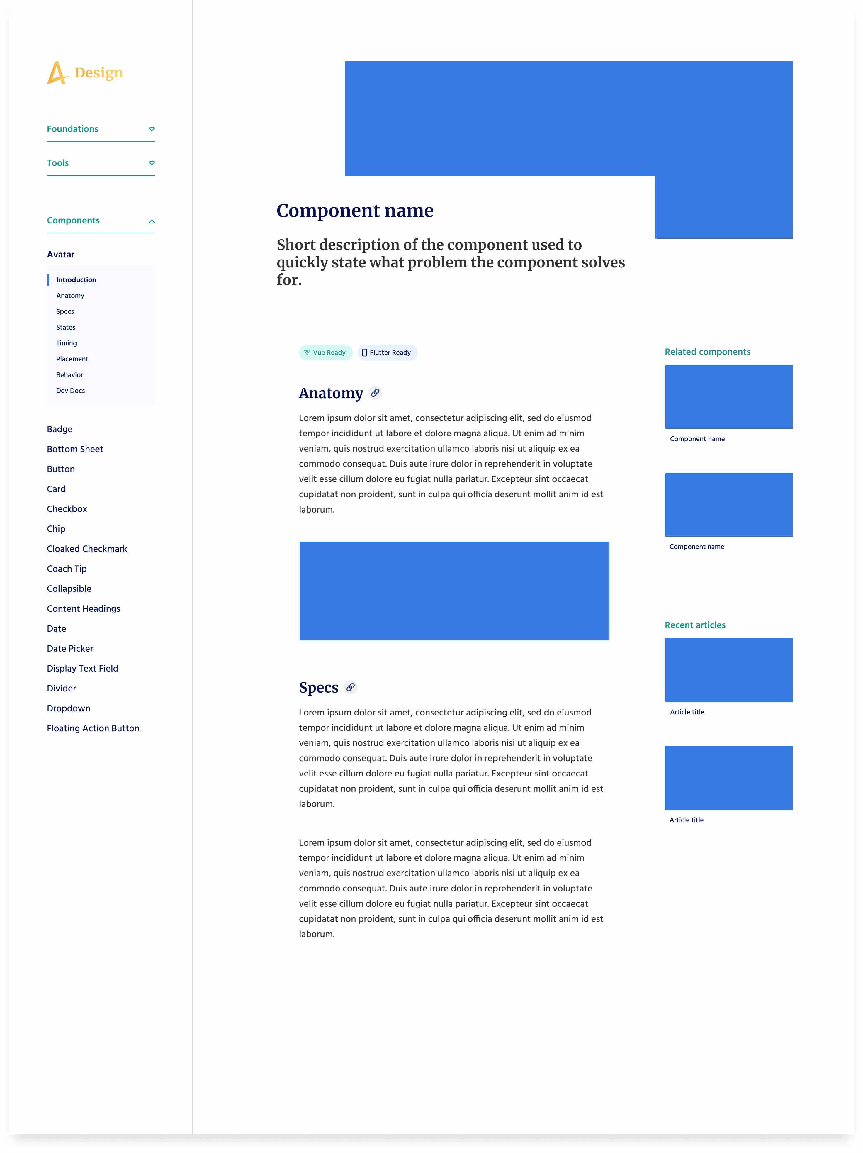
Using Webflow, each component documentation was collaboratively created with engineering via Google Docs. Once we felt the doc was ready it was transferred to the Webflow CMS platform where each component was tagged and categorized based on attributes of the component (size, themability, similar components, interactive, atomic level, etc). The Webflow docs site itself could be considered a major portfolio piece!
Implementation & Dev
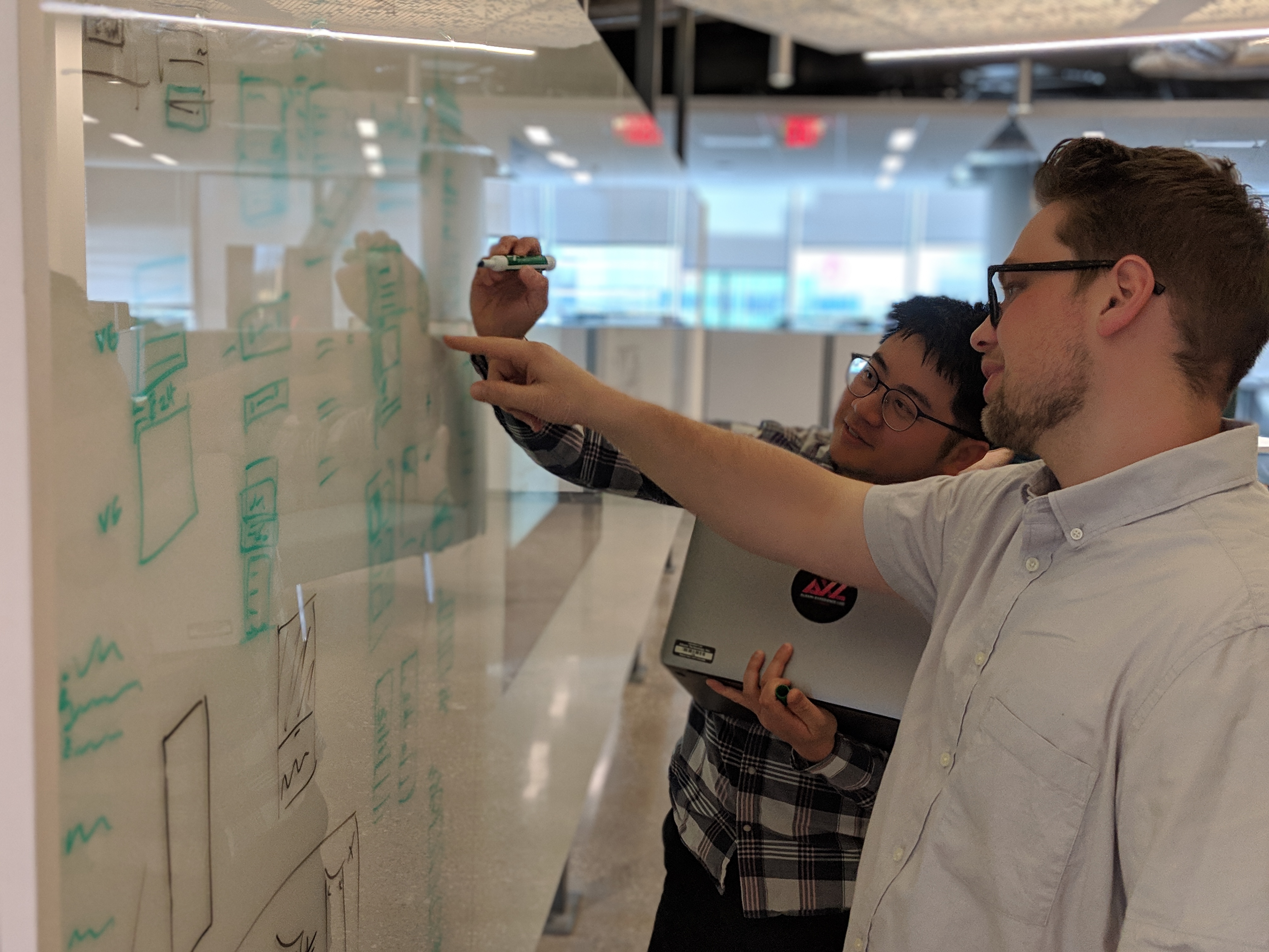
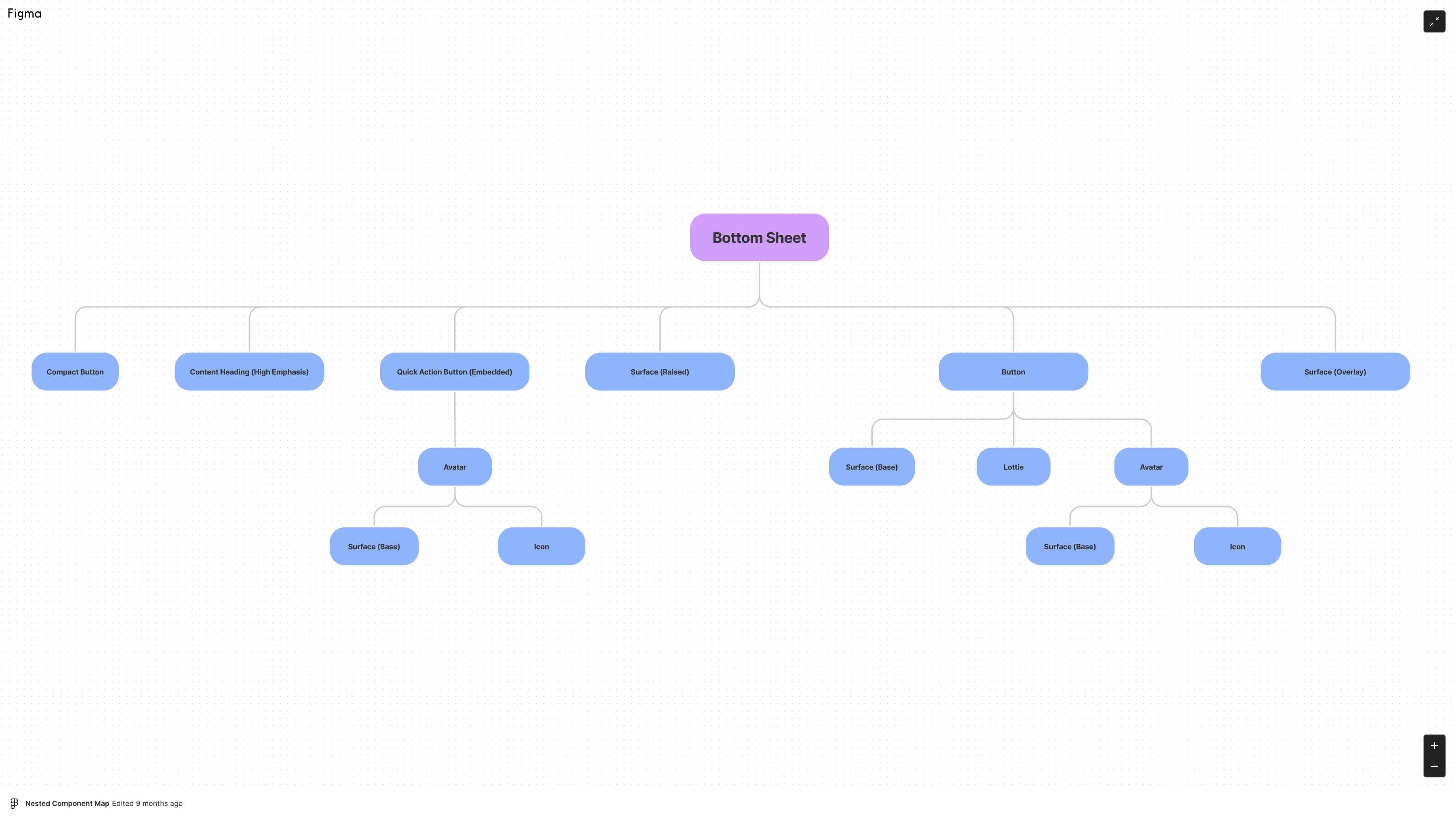
Component relationship mapping
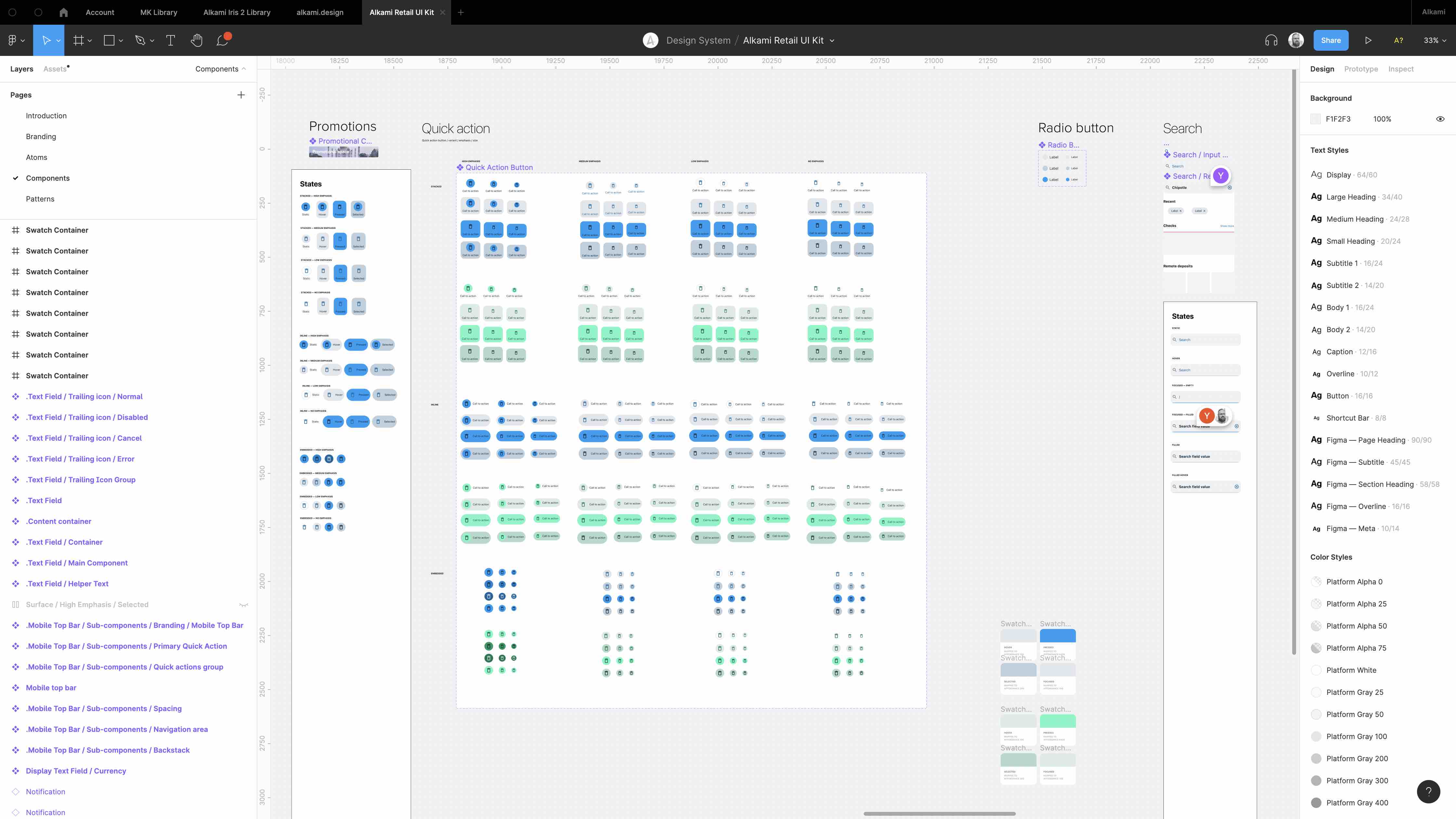
Using principles of Atomic Design, each component was mapped out to determine shared atoms and molecules. Based on this mapping we could easily see which components were commonly nested inside other components. These relationships helped prioritize development efforts and estimate release dates for the scrum teams anxiously awaiting the alpha release.
Timelines & planning
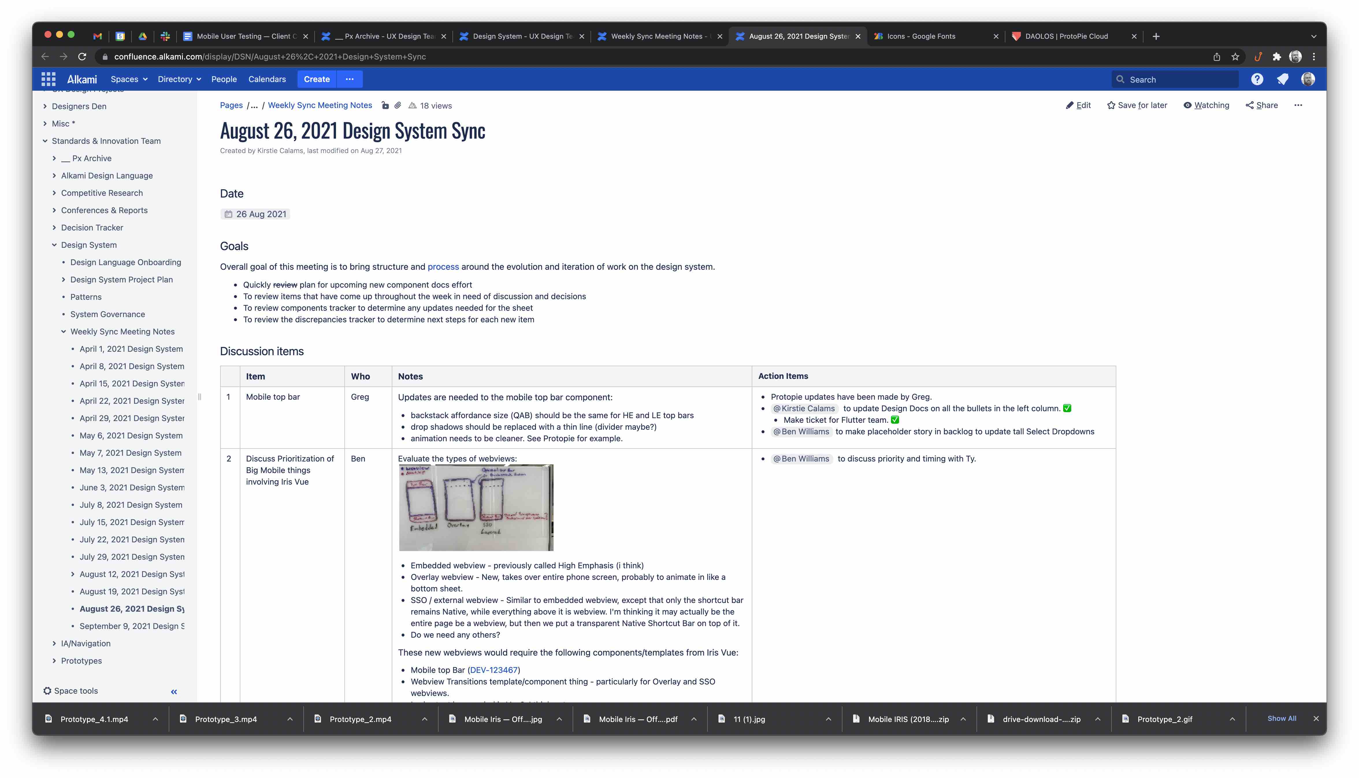
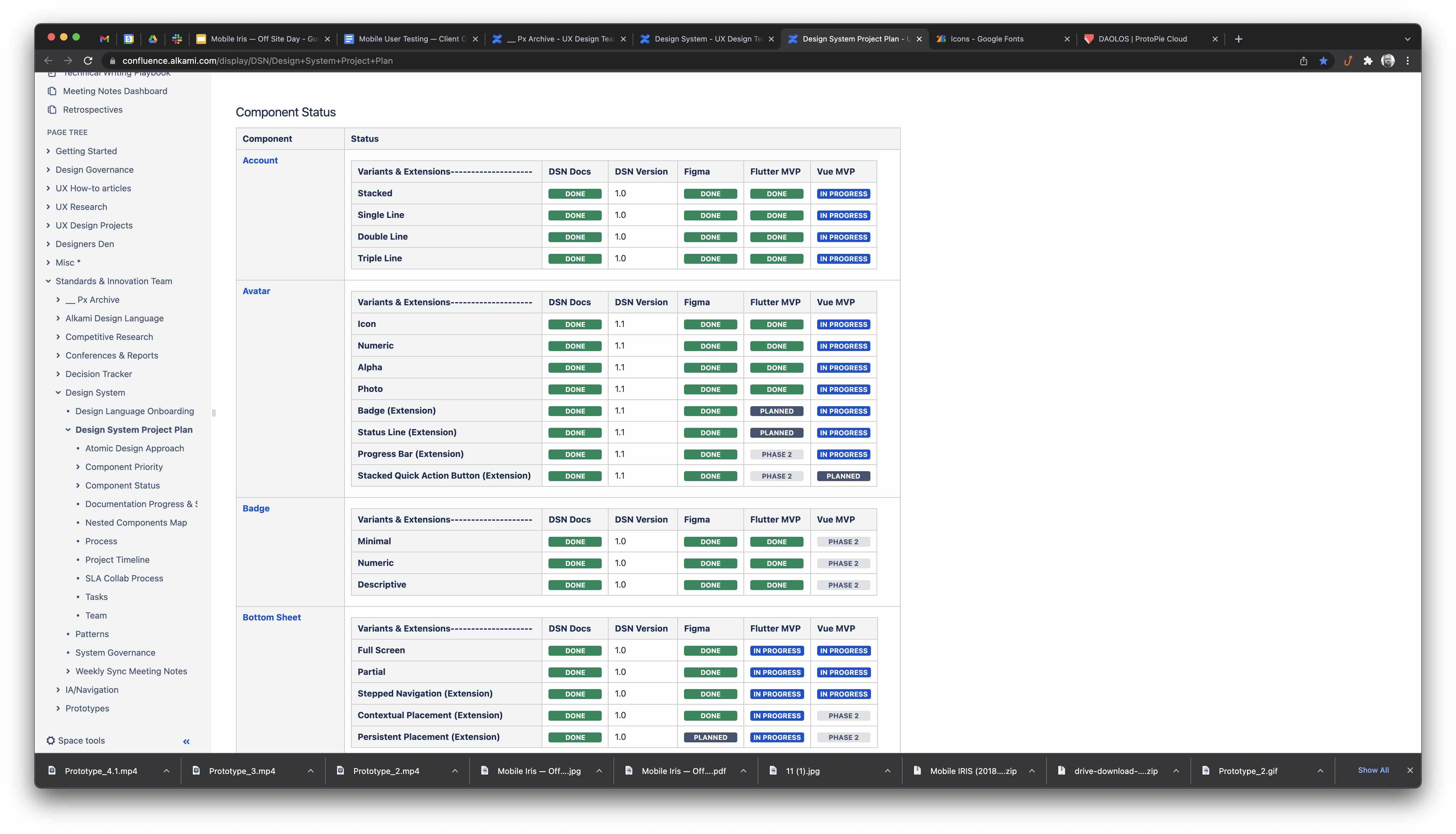
Meticulous timing and planning was required to ensure the allocated engineering resources were kept busy — working on the highest value items and in the right sequence. To ensure we were producing results early and often, component design and documentation efforts were staggered 2 weeks out prior to the development for those specific components. To minimize feasability or overengineering, each component doc was reviewed by both engineering and product before any code was written. We met weekly with product owners and lead engineers to ensure everything went smoothly and to adjust timelines as needed.
Iterations
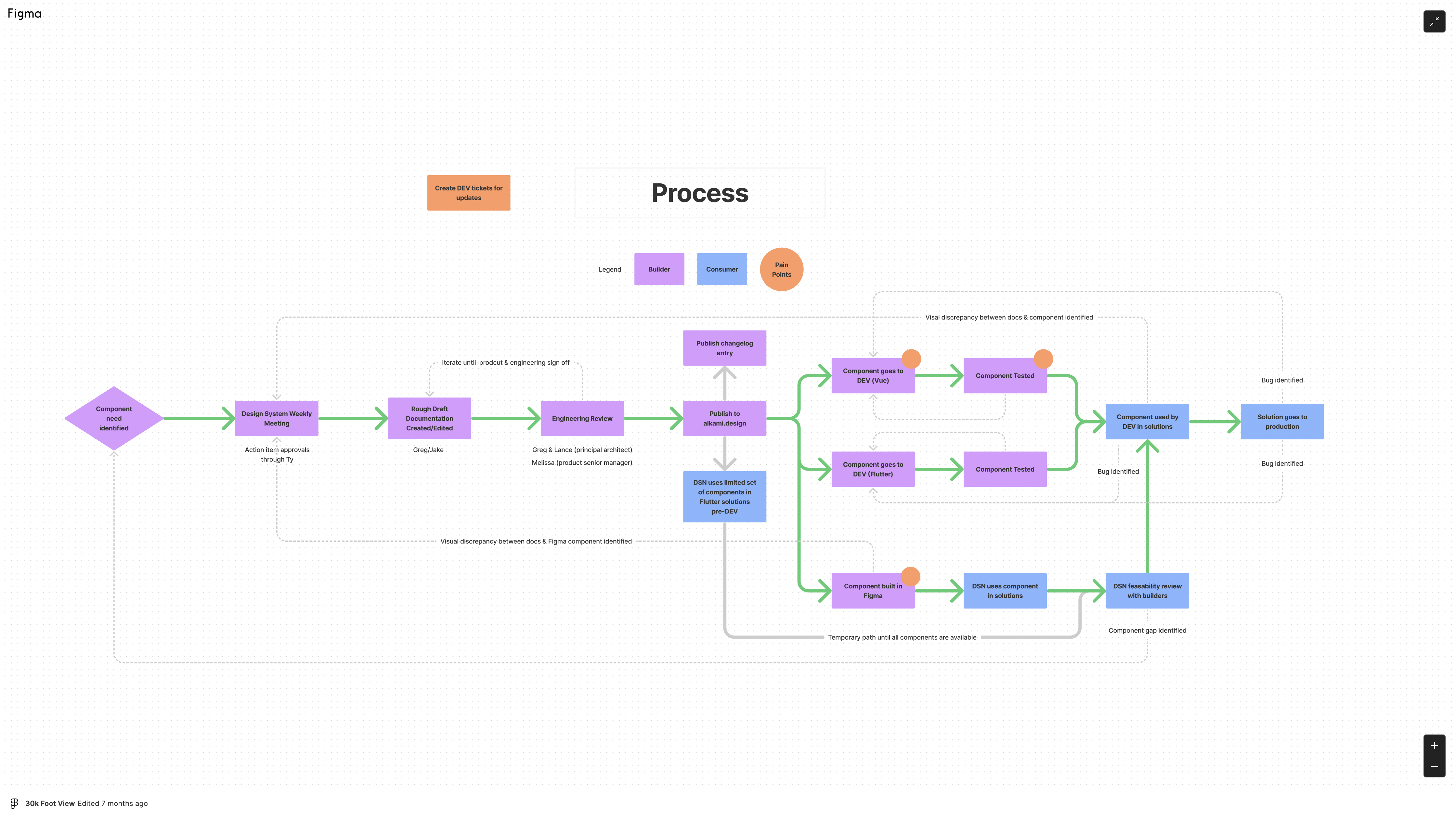
One of the core design philosophies we established is "Design is never done", which is especially true with design systems. No matter how much you test or review the coded reality of a designed vision, issues come up, features are missed, and new functionality realized once users finally start using components. We established a service level agreement between the creators of the system and the consumers of the system, and follow it whenever new features are requested or bugs discovered.
Constantly monitoring usage and asking for feedback surfaces pain points, which once discovered highlight an area for improvement. These improvements are welcomed and feed into weekly syncs for discussion.
Reflections
Now that the initial build and rollout phases are completed, looking back there are so many insights into how to be more effecient and better prepared for the next design system. The biggest takeaway is that of identifying a champion. We had to carve out time during the early phases of work, and progress was slow. It wasn't until we had a champion that could see the value and communicate upward and sideways to get the dedicated time and resources to really get things hopping.