Project Info
The new Alkami mobile experience is a white-label Flutter powered native iOS & Android digital banking app designed purposefully for a modern user with expectations of a superb user experience on par with apps used on a daily basis.
My role
As the lead designer primarily responsible for the mobile experience, I was given the opportunity to explore what the next generation mobile experience could be (a visual designers dream come true). After sharing a few mockups internally with design, sales and product leadership, demand quickly skyrocketed for the new modern look to hit new features and experiences in production.
To broaden the impact to the business even more, what started off as a few explorations turned into a mobile-only design system project — which almost immediately turned into a 2nd Gen design system for both mobile and desktop! I was given the opportunity to lead a tiger team of designers and developers and build the foundation of what would take Alkami into the next big chapter of user experience. We won't get into that here; see the Alkami Design System project for more details.
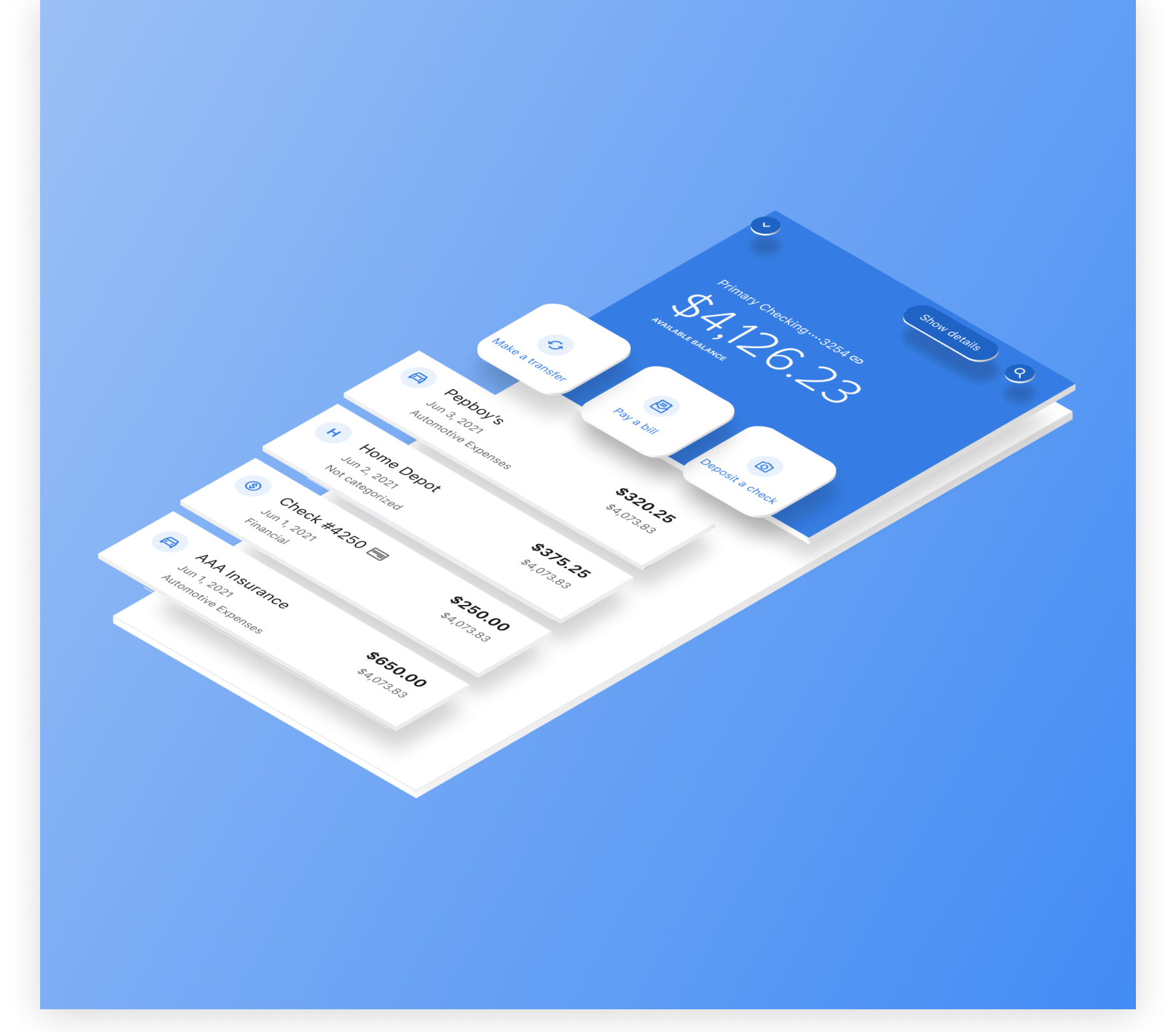
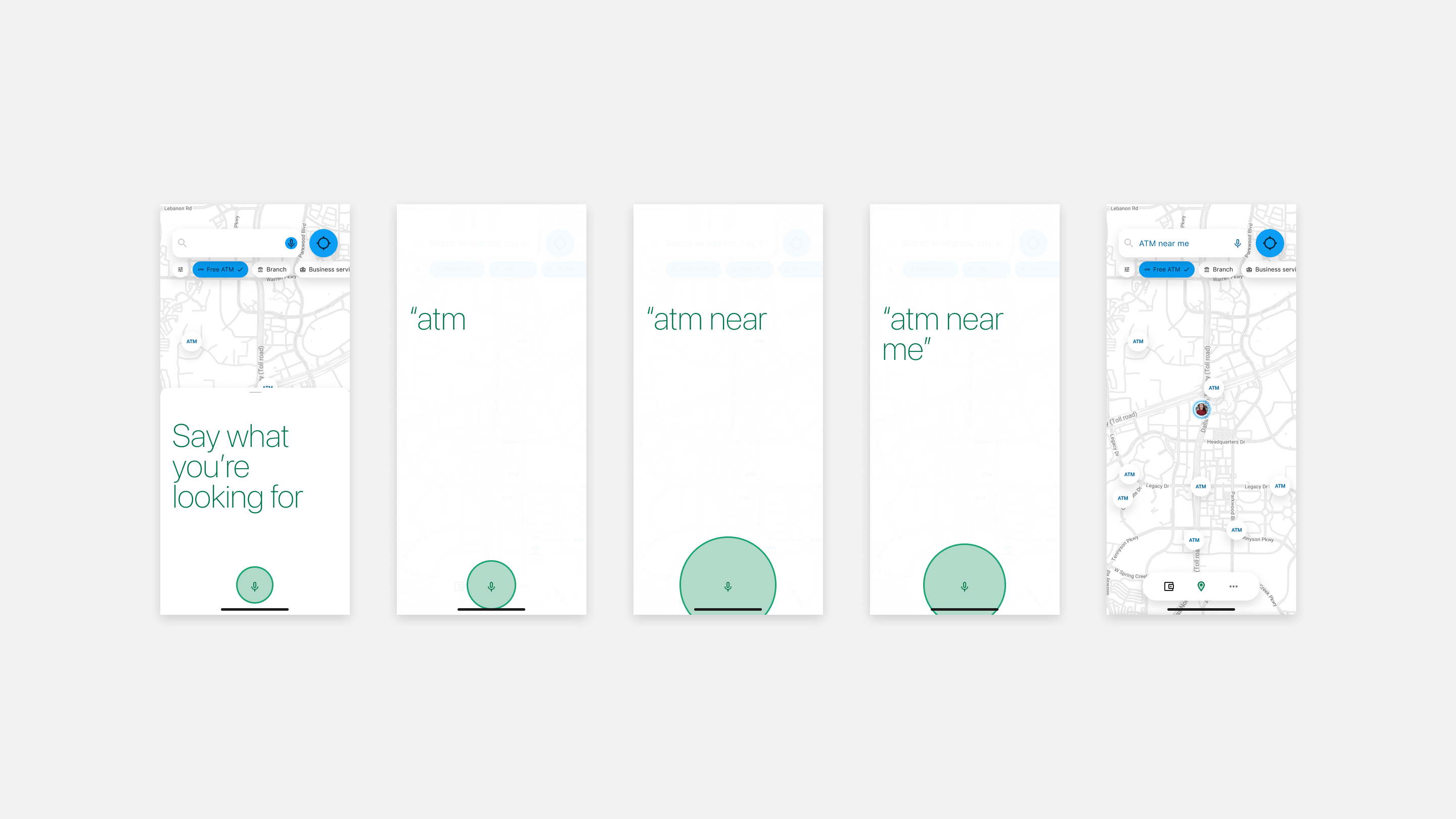
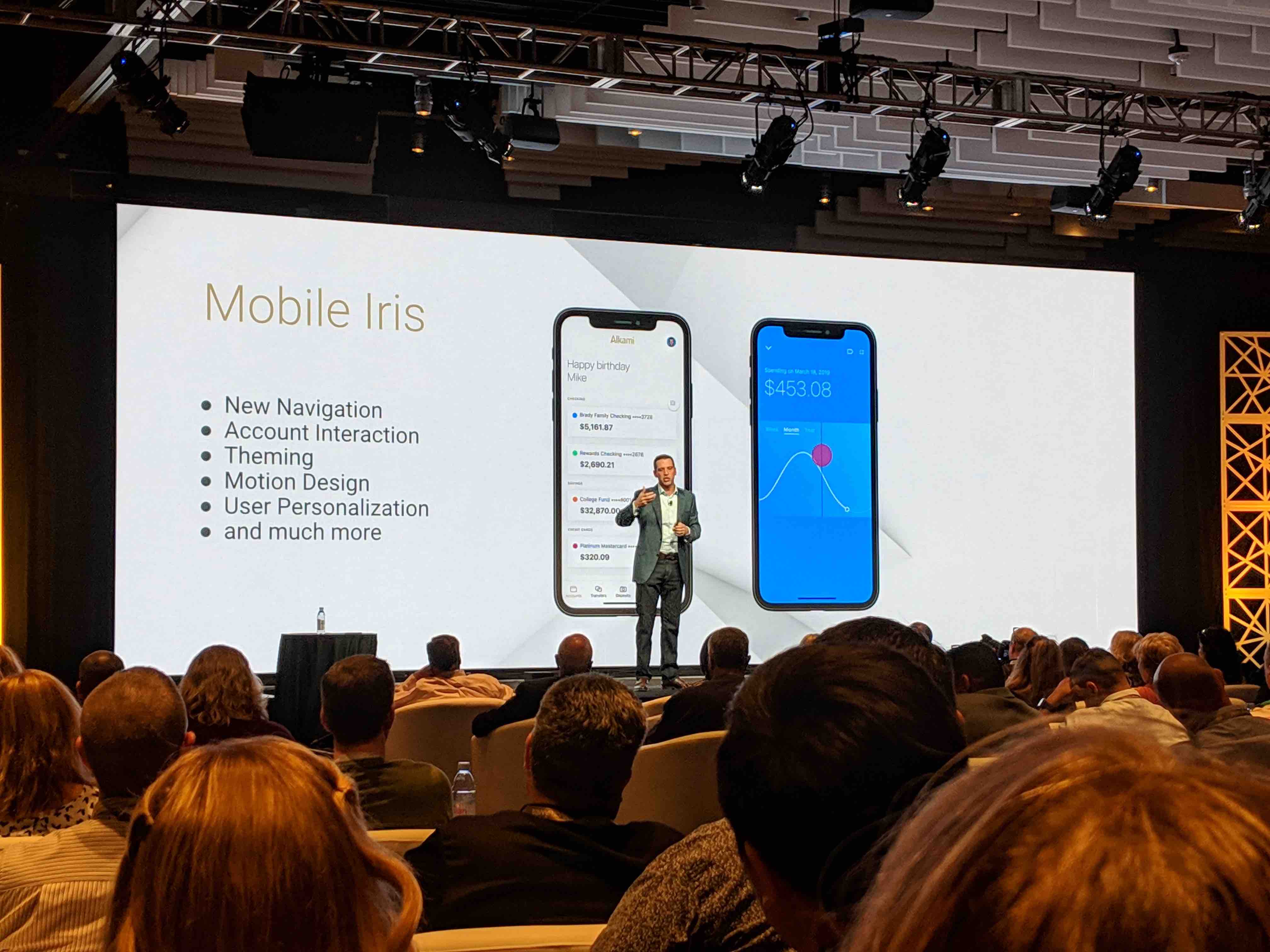
Sneak peek
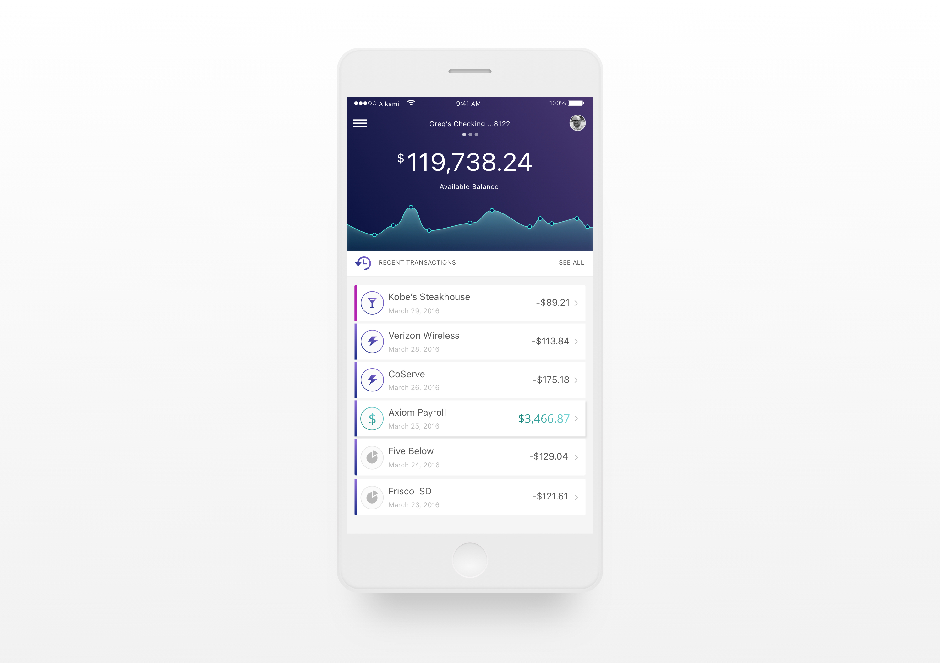
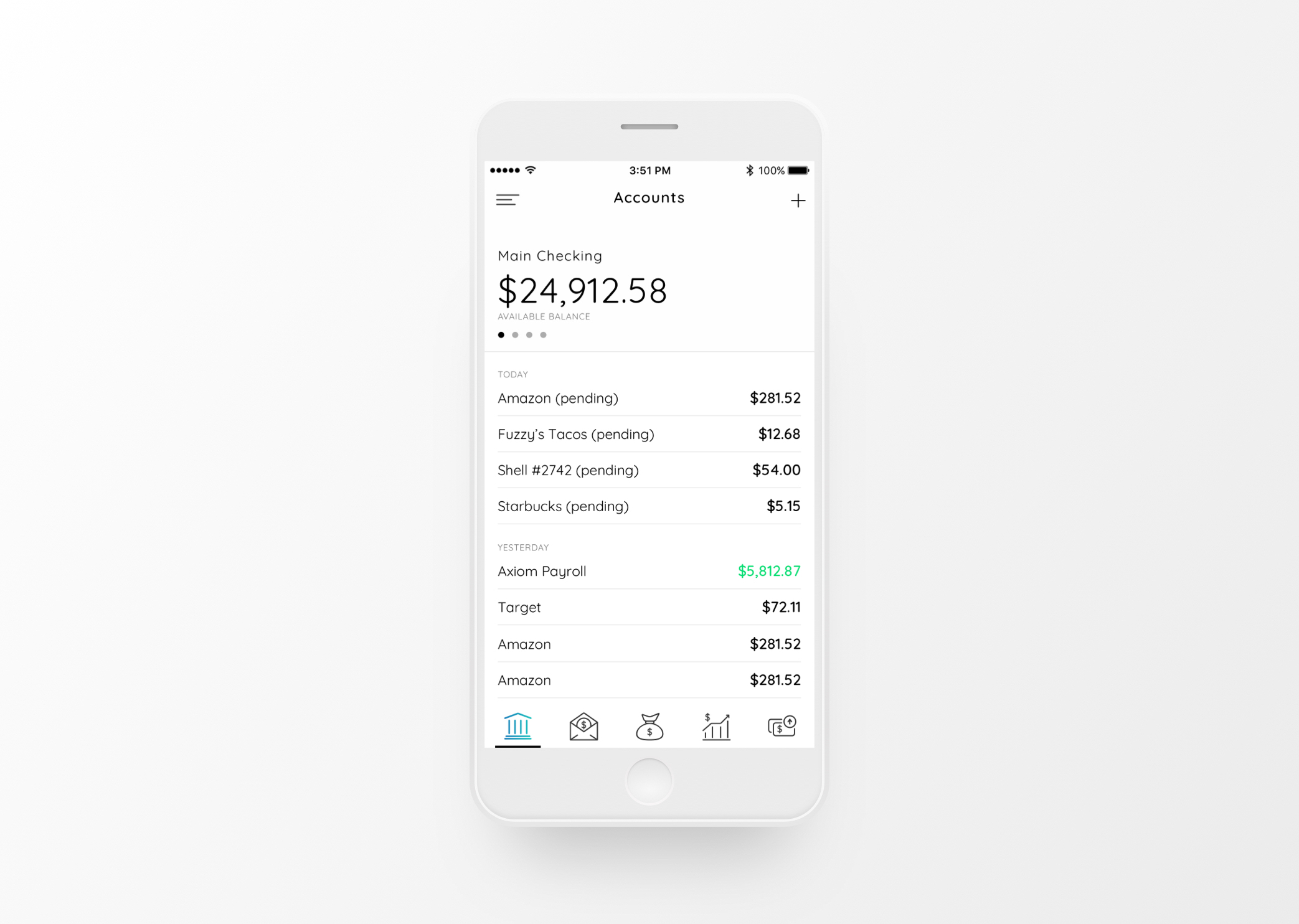
Here's a little sneak peek of the finished product. Notice the simplicity and very obvious interactive elements.
Problem to solve
Setting The Stage
Alkami needed a fresh new mobile digital banking experience, and fast! The legacy mobile experience had not seen any evolution since the very first design in 2015, and we were starting to hear from customers and users that it was feeling dated. Competitors in the space had begun to roll out fresh new mobile experiences and sales especially was demanding a more modern and fully native solution. Other than the very obvious visual refresh needs, here were the main problems the design needed to solve for:
- More branding opportunities for clients
- Deeper integration for promotional content
- Use of modern interactive patterns (swiping, long press, pinch/pull, etc.)
- Extensible navigation constructs
- Fresh new visual aestethic that could be customized & branded for each customer
- Unified design language or unique considerations for iOS vs Android
Success Metrics
From the very beginning we had usability at the forefront driving success metrics with business needs rounding out the following list:
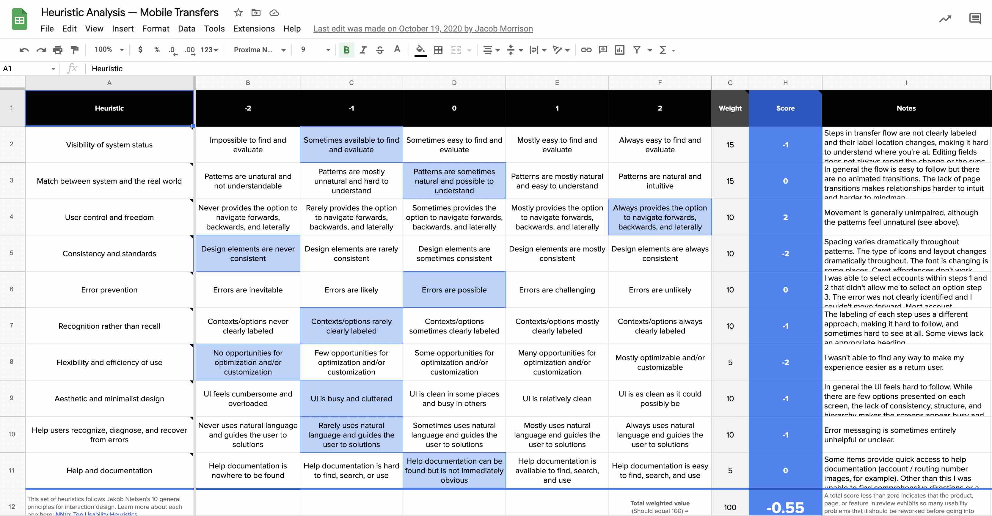
- Usability Heuristic scoring of at least 1.0
- SUS score of 95 or higher
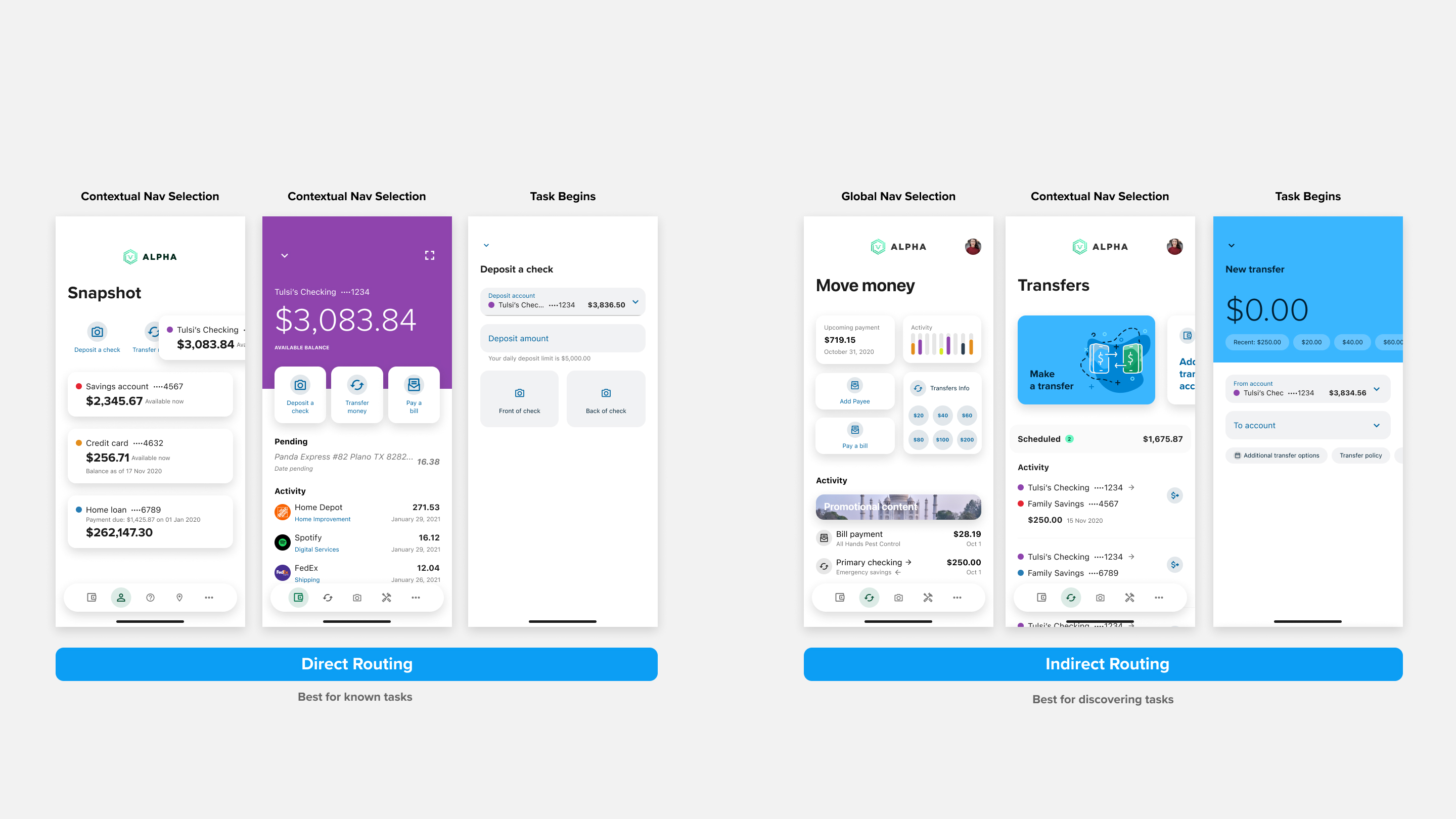
- Major task discovery within 2 taps
- Multiple routes to task start
- More use of branded color
- More opportunities for promotional content in main menu
- More opportunities for promotional content in district landing views
- Use only components that have already been coded
- Unified design language across channels
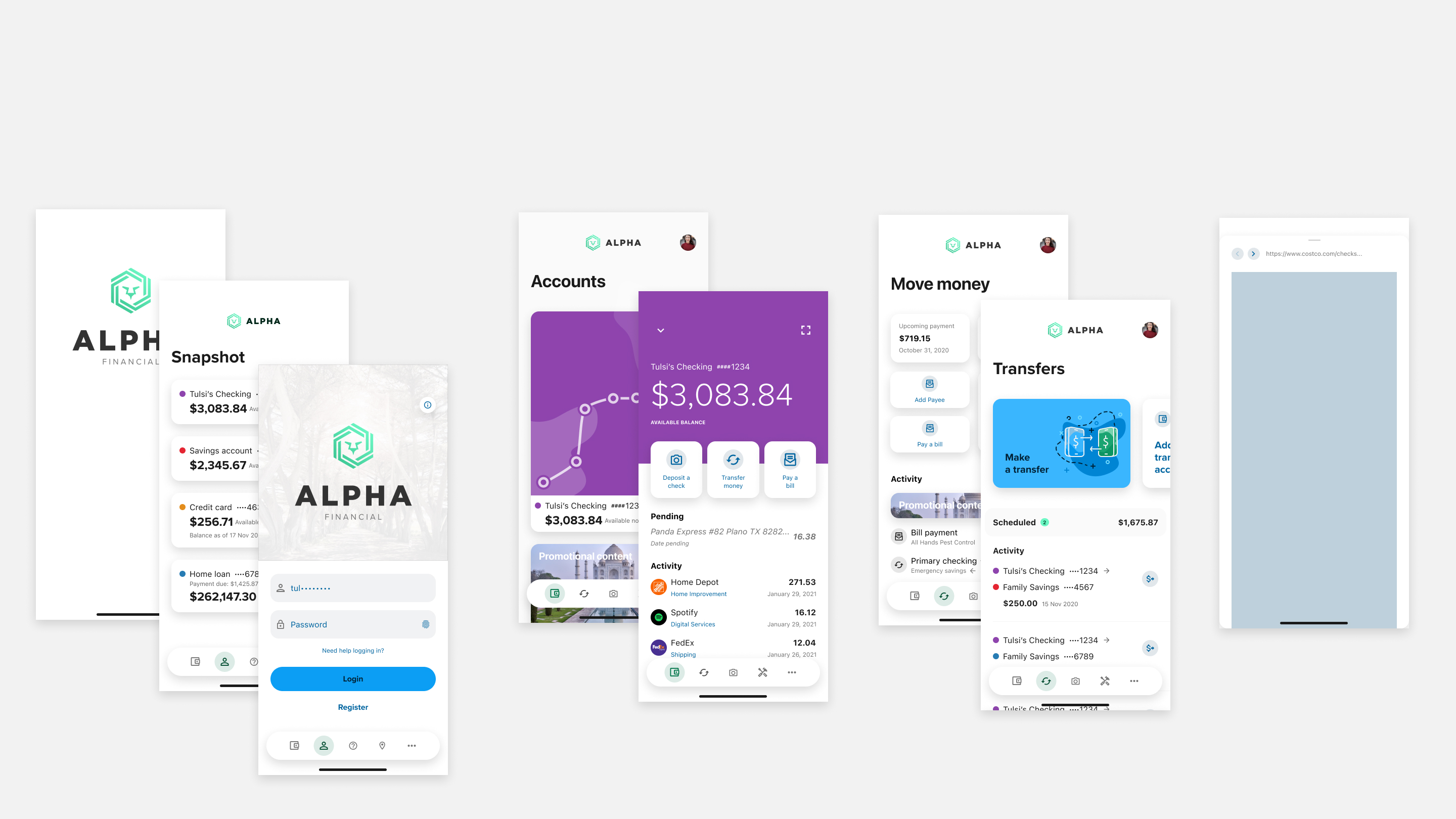
Explorations
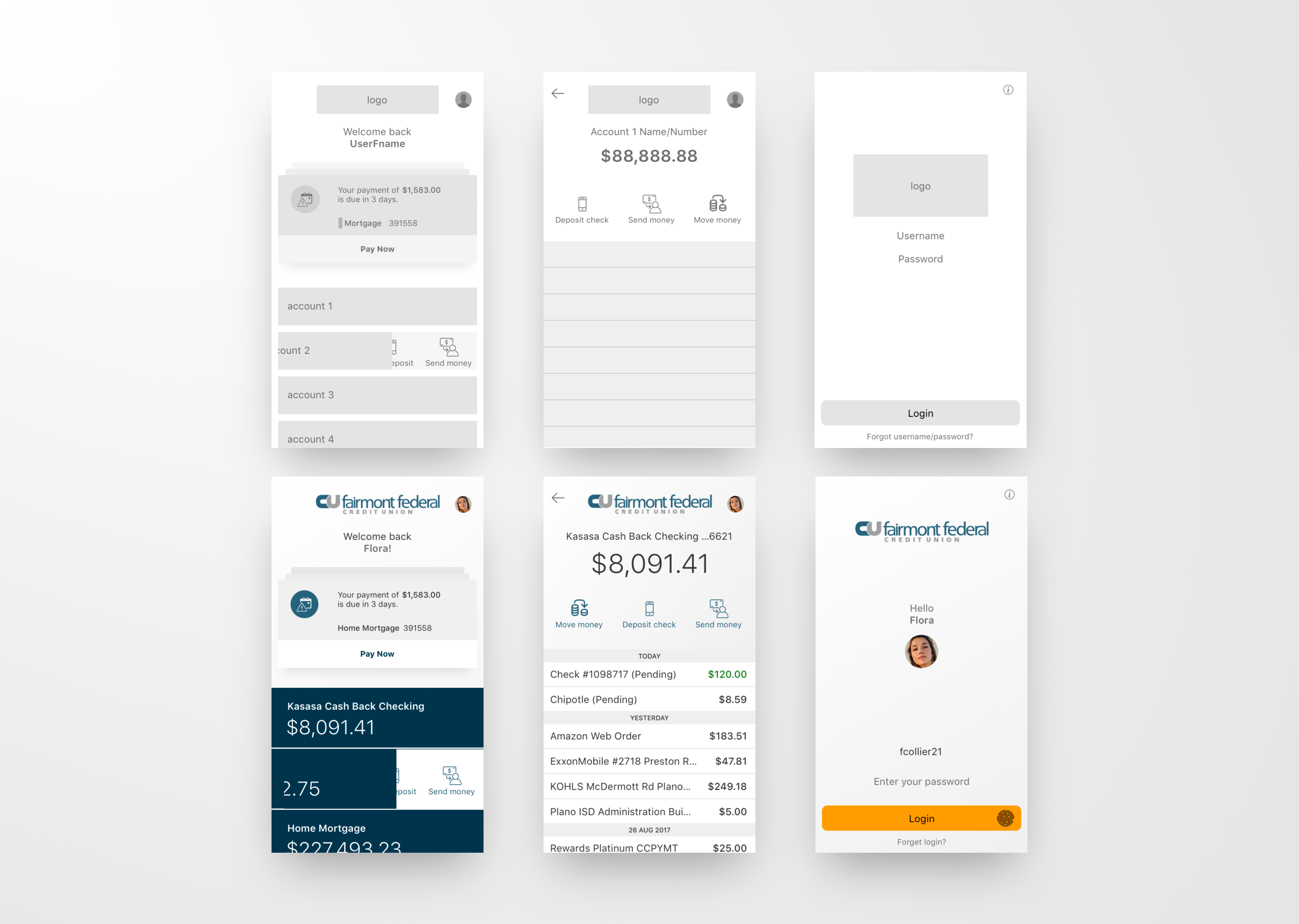
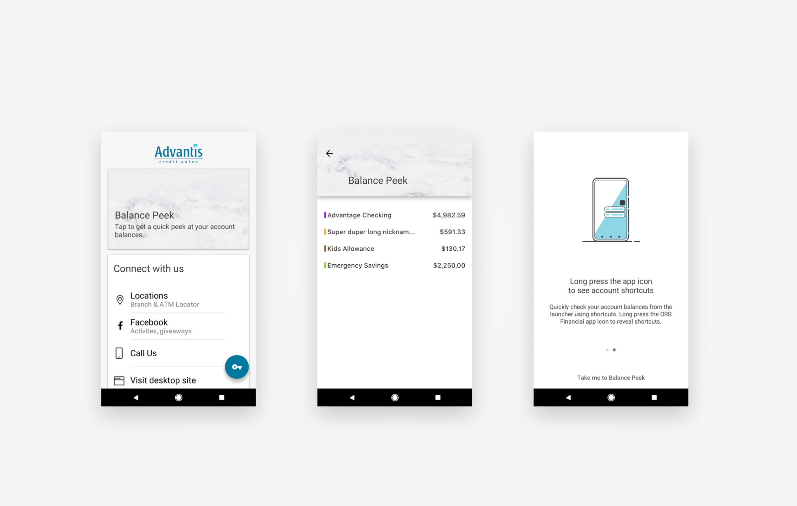
Starting off with research to understand what the market would bear (the visual zeitgeist), and what would resonate most with both clients and end-users, we started with a few vision/mood boards.
User Testing
Client Feedback
Each year the annual client conference brings hundreds of our clients into town, which meant the perfect opportunity to get reactions and feedback to explorations we were working on. We wanted to walk away from the conference confident that our clients supported the new direction we would eventually take with the mobile experience.
Clients went nuts for all three prototypes and we ultimately combined aspects of all three. The big takeaway was we were on the right track. Onward!
Testing Metrics
With a clear set of success metrics up front, we were able to baseline the legacy experience and compare to prototypes. All three prototypes scored well above 1.0 on the heuristic evaluation and 95 on the SUS. Onward!
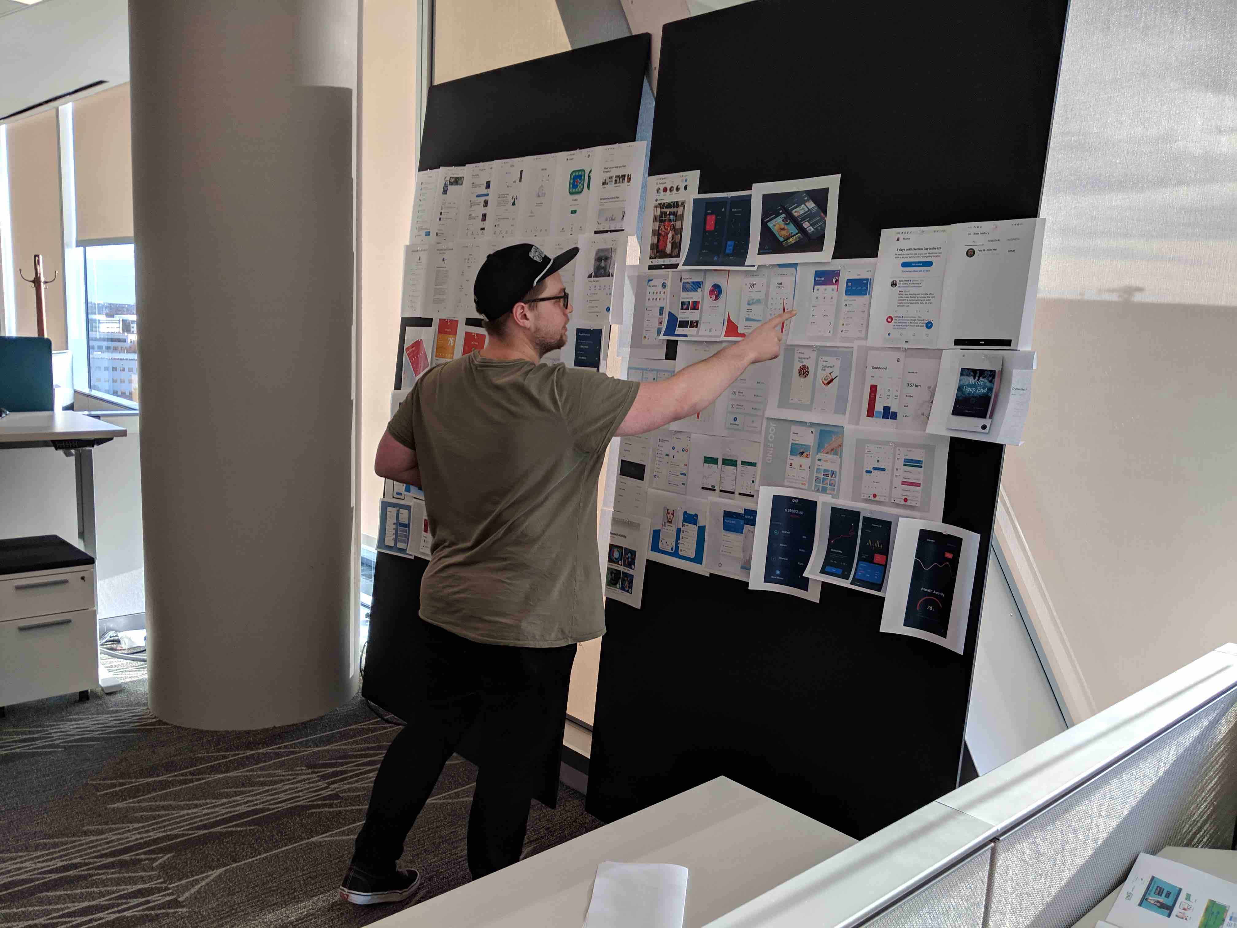
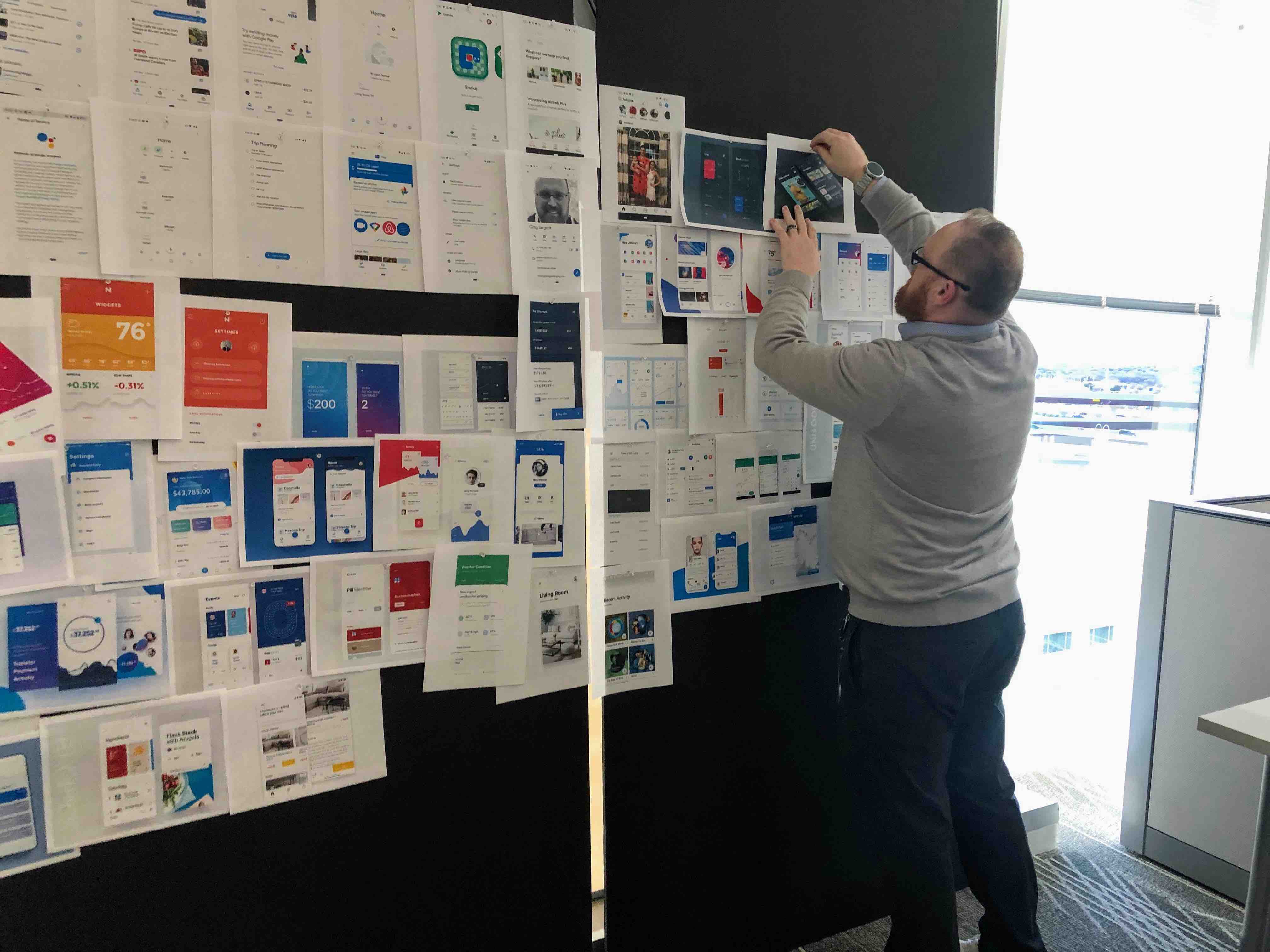
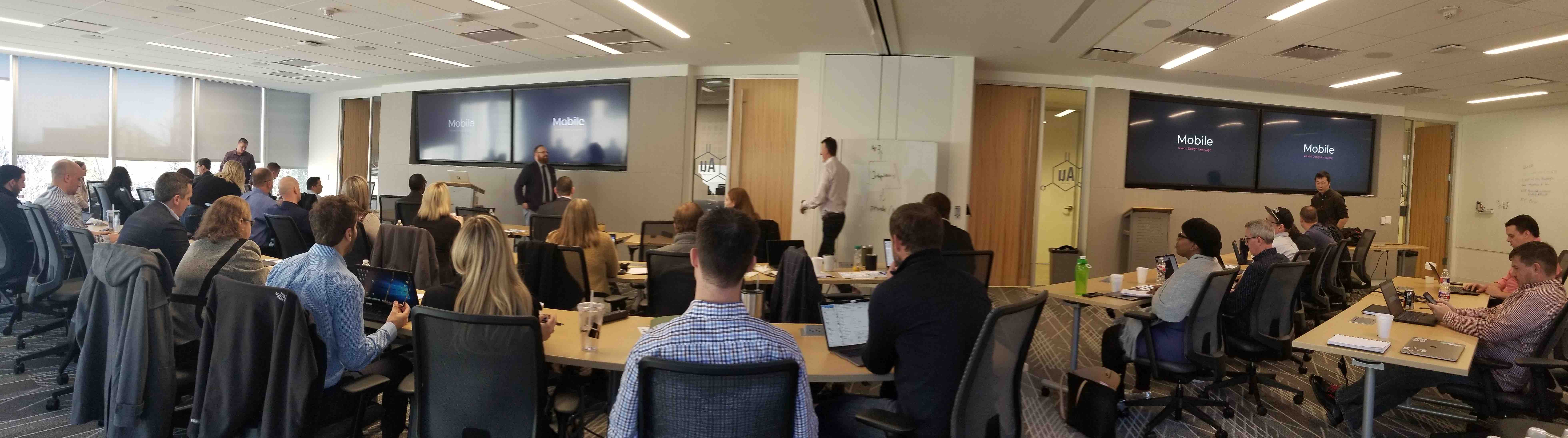
Engineering Roadshow
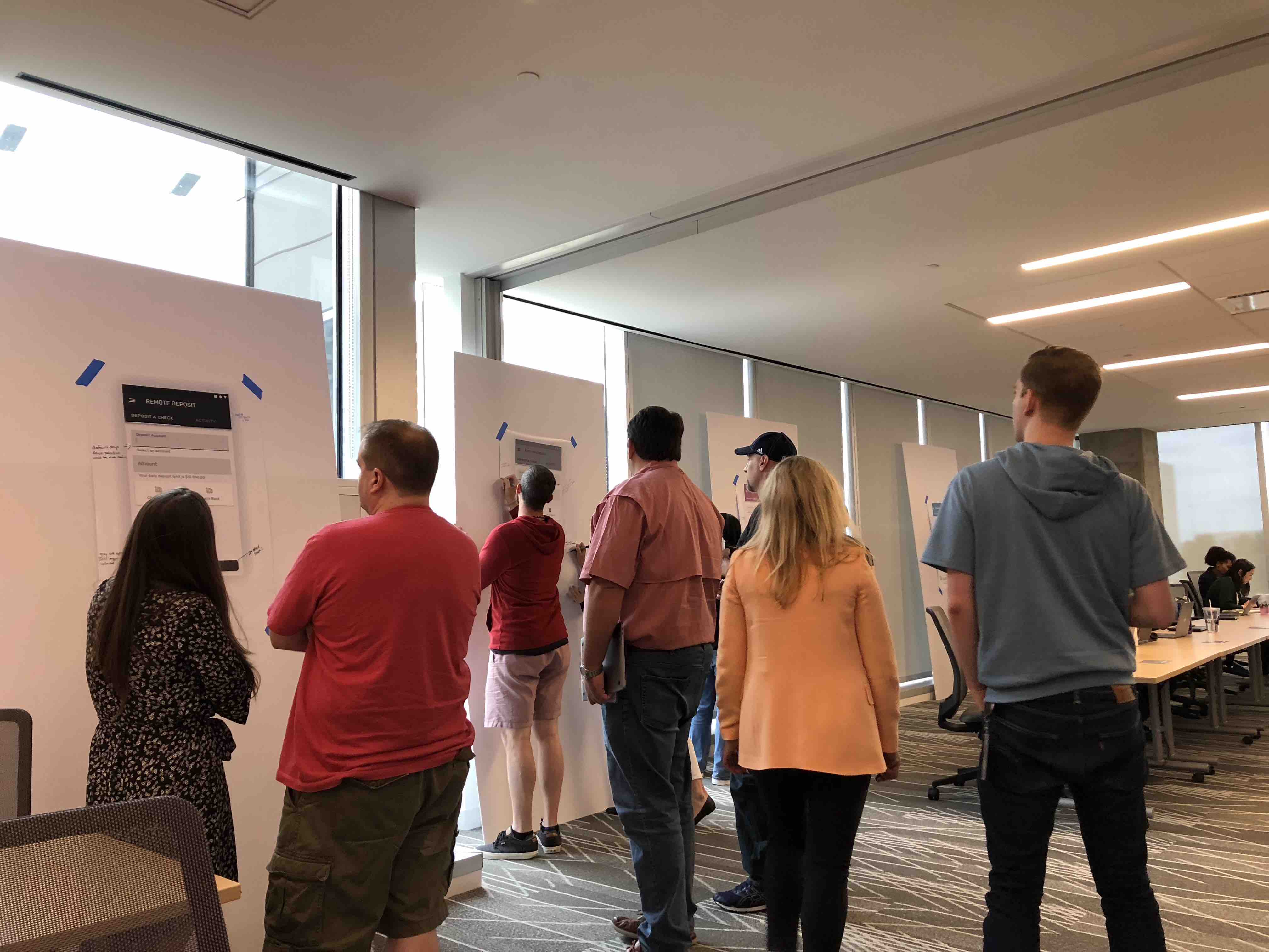
We knew that if we presented the mobile experience as an end-product wrapped up in a bow, we would ultimately run into engineering hurdles. So we included various scrum teams and architects in the design process.
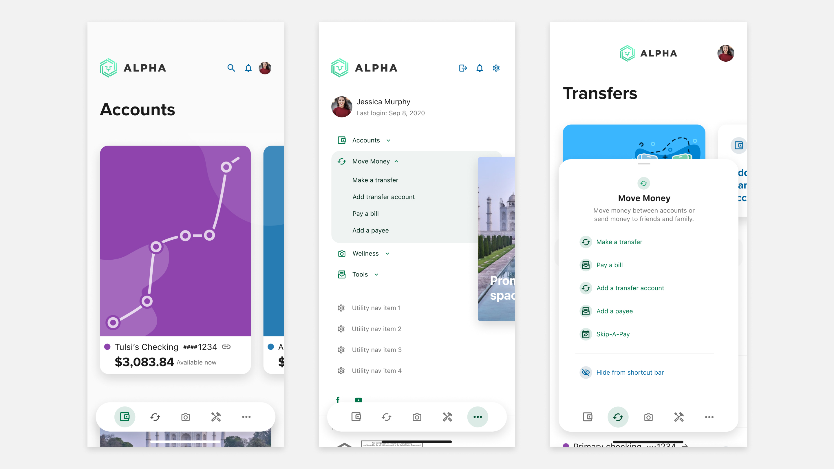
Solution
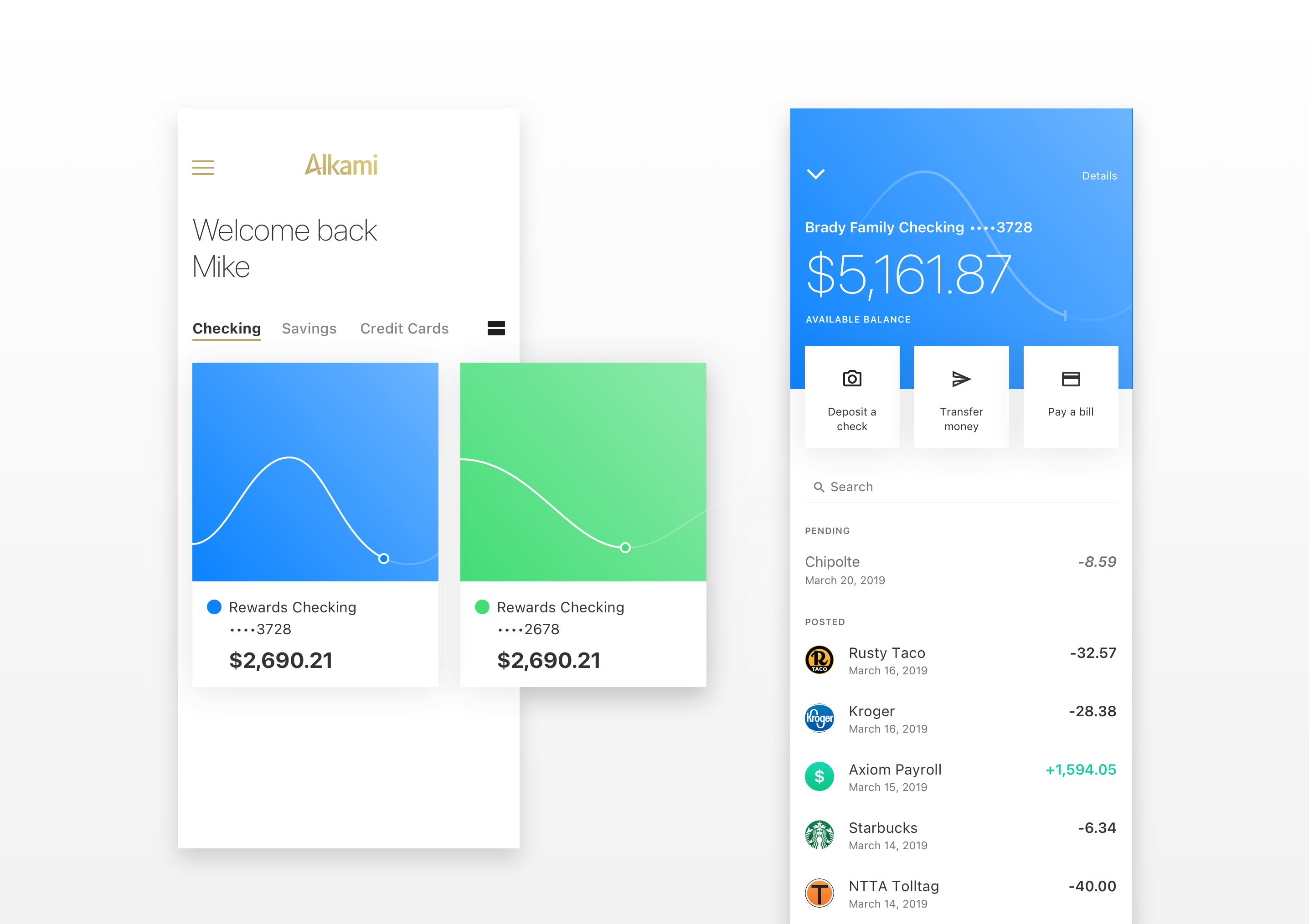
Using the newly defined Alkami Design Language and components from the new Alkami Design System, we used all the inputs from testing to create a final proof of concept. This concept became the north star for the company's mobile strategy.
Implementation & Dev
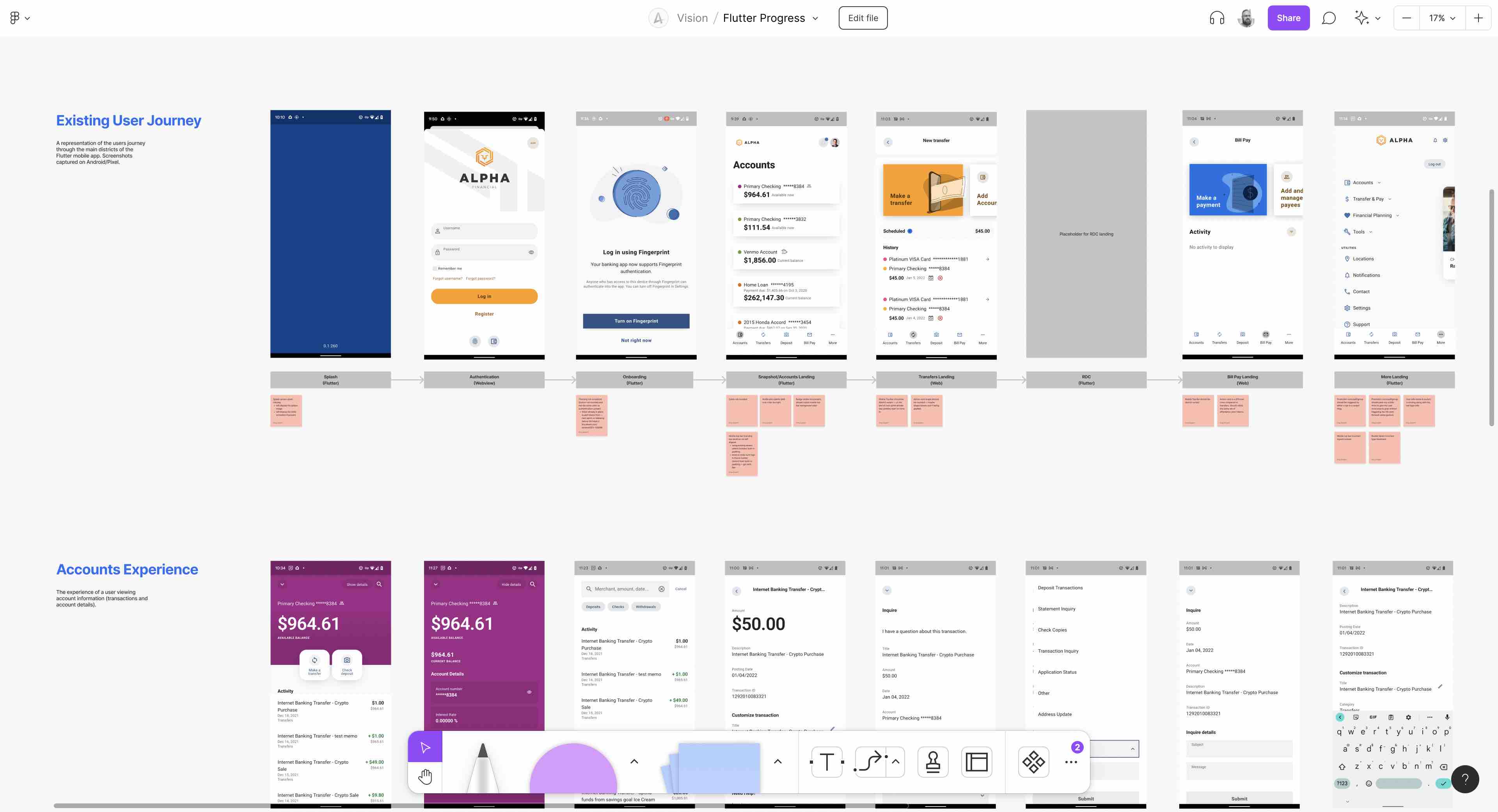
Using FigJam collaboration tools, anyone can download the Testflight version of the app and tap through the experience. If any visual discrepancies are identified, a screenshot is taken and placed in the FigJam project with a description/sticky note.
Routinely leads get together to go through issues and create tickets for further iteration.
Reflections
This has been a massive project with many peaks and valleys! Looking back I can clearly see areas where we could have added resources to speed things up, or rolled resources off back onto their main teams. If I could go back and start again I would certainly have a dedicated innovation team running full time discovering opportunities and prototyping potential solutions.